Re-Creating The Pop-Out Hover Effect With Modern CSS (Part 1)

Re-Creating The Pop-Out Hover Effect With Modern CSS (Part 1)

Re-Creating The Pop-Out Hover Effect With Modern CSS (Part 1)

Temani Afif

2023-09-29T11:00:00+00:00
2023-10-03T22:06:48+00:00

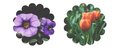
In a previous article on CSS-Tricks, I demonstrated how to create a fancy hover effect where an avatar pops out of a circle on hover. The challenge was to make such an effect using only the <img> tag.

See the Pen [Fancy hover effect on avatar](https://codepen.io/t_afif/pen/MWBjraa) by Temani Afif.

See the Pen Fancy hover effect on avatar by Temani Afif.

That was a fun exercise! I relied on a combination of classic styling tricks involving background, outline, and mask to create the effect. This time, I want to pull off something similar while pushing the limits of CSS a little further to create a more complex effect using a few of the newer features that have been released in CSS over the past couple of years — things like shapes made from gradients paired with trigonometric functions and custom properties.

We are going to put those concepts to use to spice up the last demo. Instead of a simple circle, we will have a kind of flower shape that rotates and… well, a demo worth a thousand words:

See the Pen [Fancy Pop Out hover effect!](https://codepen.io/t_afif/pen/qBQzrwq) by Temani Afif.

See the Pen Fancy Pop Out hover effect! by Temani Afif.

Cool, right? We have a fancy shape that rotates. On hover, the avatar pops out of the frame, the rotation speeds up, and the shape is slightly modified — all at the same time. And, it’s worth calling out that it’s done with nothing more than a single <img> element in the markup. Better yet, we won’t even be reaching for pseudo-elements, like :before and :after in the process. It’s a great demonstration of what CSS can do these days!

I do want to note, however, that we’re going to be living on the bleeding edge a bit. So, while all of the concepts we’re covering here are fun, I wouldn’t say that everything is production-ready at this point, as they have yet to be implemented in one browser or another. For the sake of demonstration, I suggest viewing the work we do together in Chrome or Edge since they do indeed support everything we’re discussing.

We’ll tackle this one step at a time, starting with an image against a masked shape to create the frame. From there, we’ll handle the rotations before topping things off with the pop-out effect from the last demo.

Masking The Frame

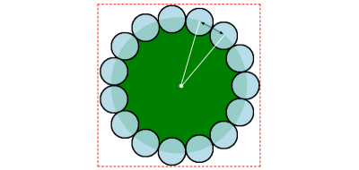
Let’s start by creating a flower shape using CSS masks. This is what we are aiming for:

Two pictures of flowers

(Large preview)

I know it might seem like this shape requires advanced trickery. But if we break it down a bit, all we’re really talking about is a series of small circles around a much larger circle.

A flower shape as a series of small circles around a much larger circle

(Large preview)

We are going to rely on radial-gradient and some math, specifically trigonometric functions. Bramus Van Damme provides an excellent primer on trigonometric functions over at web.dev. It’s very much worth your while to brush up on the concept with that article.

We are going to define two variables to control the flower shape. N represents the number of the small circles, and R is the diameter of the small circles (Illustrated by the black arrow in the figure above). If we have the diameter, then we can calculate the radius by dividing R by 2. This is everything we need to create the shape!

Here is what the code of a small circle looks like:

img {
  --r: 50px;
  mask:
    radial-gradient(#000 70%, #0000 72%) no-repeat
    {position} / var(--r) var(--r);
}

All of the small circles can use the same radial gradient. The only difference between them is the position. Here comes the math:

(50% + 50% * cos(360deg * i/N)) (50% + 50% * sin(360deg * i/N))

N is the number of circles, and i is the index of each circle. We could manually position each circle individually, but that’s a lot of work, and I believe in leveraging tools to help do some of the heavy lifting. So, I’m going to switch from CSS to Sass to use its ability to write loops and generate all of the circle positions in one fell swoop.

$n: 15; /* number of circles */

img {
  --r: 50px; /* control the small circles radius */
  $m: ();
  @for $i from 1 through ($n) {
    $m: append($m, 
         radial-gradient(#000 70%,#0000 72%) no-repeat
          calc(50% + 50% * cos(360deg * #{$i / $n})) 
          calc(50% + 50% * sin(360deg * #{$i / $n})) /
            var(--r) var(--r), 
        comma);
   }
  mask: $m;
}

We’re essentially looping through the number of circles ($n) to define each one by chaining the radial gradient for each one as comma-separated values on the mask ($m) that is applied to the image element.

We still need the large circle that the small circles are positioned around. So, in addition to the loop’s output via the $m variable, we chain the larger circle’s gradient on the same mask declaration:

img {
  /* etc */
  mask: $m, radial-gradient(#000 calc(72% - var(--r)/2),#0000 0);
}

Finally, we define the size of the image element itself using the same variables. Calculating the image’s width also requires the use of trigonometric functions. Then, rather than doing the same thing for the height, we can make use of the relatively new aspect-ratio property to get a nice 1:1 ratio:

img {
  /* etc */
  width: calc(var(--r) * (1 + 1/tan(180deg / #{$n})));
  aspect-ratio: 1;
}

Check it out. We have the shape we want and can easily control the size and number of circles with only two variables.

See the Pen [Flower shape using CSS Mask](https://codepen.io/t_afif/pen/poQMvbV) by Temani Afif.

See the Pen Flower shape using CSS Mask by Temani Afif.

Rotating The Shape

Now, let’s rotate the shape. The idea is to move the smaller circles around the bigger circle to simulate the rotation of the whole shape.

To do this, we are going to animate the angle. That same angle is used to place the circles, so by adjusting it slightly, we create a circular movement.

img {
  --a: 0deg;
  $m: ();
  @for $i from 1 through ($n) {
    $m: append($m, 
         radial-gradient(#000 70%, #0000 72%) no-repeat
          calc(50% + 50% * cos(360deg * #{$i/$n} + var(--a))) 
          calc(50% + 50% * sin(360deg * #{$i/$n} + var(--a))) /
            var(--r) var(--r), 
        comma);
   }
  animation: rotate 10s linear infinite;
  /* etc */
}
@keyframes rotate {
  to { --a:360deg }
}

That looks super complex, right? But really, it’s the same equation we had before, but with the addition of a new variable that represents the angle (--a) in degrees and applies an animation on the image. Instead of having a fixed angle equal to 360deg * #{$i/$n}, the angle is controlled with the --a CSS variable that we animate from 0deg to 360deg to create a full rotation.

Here’s where we would get stuck without a little extra dash of modern CSS magic. Traditionally, CSS is unable to interpolate between CSS variables. That’s changed with the introduction of @property. It allows us to register a custom property and define its characteristics and, more precisely, its type (using syntax) so that the browser knows how to interpolate its values. It’s like writing our own little CSS specification.

@property --a {
  syntax: "<angle>";
  initial-value: 0deg;
  inherits: false;
}

Voilà! We have rotation.

See the Pen [Rotating the flower shape](https://codepen.io/t_afif/pen/oNQKgGX) by Temani Afif.

See the Pen Rotating the flower shape by Temani Afif.

Now, let’s try to control the rotation on hover. What about slowing it down on hover? Or speeding it up? Again, this is already possible in CSS, but even better with a modern technique that doesn’t require extra markup. And where we might have needed to define multiple @keyframes, we now only need one.

.box {
  --d: 5s; /* Animation duration */
  --s: 0.5; /* Speed factor 
       0: no change in speed
       [0 1]: decreases the speed
       1: stops the animation
       [1 +infinity]: moves in the opposite direction */
  
  --_a: r linear infinite;
  animation: 
    var(--_a) var(--d),
    var(--_a) calc(var(--d) / var(--s)) reverse paused;
  animation-composition: add;
}

.box:hover {
  animation-play-state: running;
}

@keyframes r {
  to { rotate: 1turn }
}

The whole trick relies on the animation-composition property. Quoting MDN:

“The animation-composition CSS property specifies the composite operation to use when multiple animations affect the same property simultaneously.”

Quoting again, this time regarding the add value:

add
The effect value builds on the underlying value of the property. This operation produces an additive effect.

I am applying the same animation (named r for rotation) twice on the image, and by using animation-compositon: add, both animations are combined. Notice how the second animation runs in reverse and is paused. This means we initially ran the first animation. Then, on hover, both animations run simultaneously.

And here comes the magic.

The result depends on the duration of the animations. If both animations run at the same duration, the element stops altogether. The way we’ve implemented the animations is that one moves forward and the other in reverse, resulting in no movement at all. Yes, there’s a little physics to all of this.

Now, if the second animation is slower (i.e., has a larger duration value) than the first, the initial rotation slows down. But if the second animation is faster (i.e., has a smaller duration value) than the first, the element rotates in the opposite direction.

This may sound a bit confusing, but once you play with the code, it becomes a lot easier to understand, especially if you’re a visual learner. Here is a demo where you can adjust the different variables to play with the results:

See the Pen [Hover to slow down the animation](https://codepen.io/t_afif/pen/vYQNLoe) by Temani Afif.

See the Pen Hover to slow down the animation by Temani Afif.

Let’s apply this to our example and slow down the rotation on hover:

See the Pen [CSS-only Flower mask with rotation and hover effect](https://codepen.io/t_afif/pen/XWyGWyJ) by Temani Afif.

See the Pen CSS-only Flower mask with rotation and hover effect by Temani Afif.

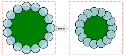
That’s awesome! The only added bit in this example is a scale effect to the smaller circle on hover. So, on hover, the smaller circles change size in addition to the rotation slowing down.

Creating The “Pop Out” Effect

We’ve been focusing on the frame up to this point, but let’s re-introduce the avatar from the original demo and work on making it “pop” out of the frame on hover.

Unfortunately, we are unable to simply re-purpose the same mask we created for the frame. If we did, this is the result:

See the Pen [Apply the mask to the avatar image](https://codepen.io/t_afif/pen/WNLejBB) by Temani Afif.

See the Pen Apply the mask to the avatar image by Temani Afif.

We need to make sure the mask doesn’t hide the top of the avatar; otherwise, the mask sits on top of it. Let’s add another mask layer to the top portion of the frame without obscuring the bottom half of the flower shape.

img {
  /* Same Sass loop, variables, etc. */
  mask:
   linear-gradient(#000 0 0) top / 100% 50% no-repeat, /* the new mask layer */ 
   radial-gradient(#000 calc(72% - var(--r)/2), #0000 0),
   $m;

We’re using a linear gradient this time since that’s sufficient for covering the top half of the image element’s frame:

See the Pen [Removing the top portion of the mask](https://codepen.io/t_afif/pen/xxmKrKd) by Temani Afif.

See the Pen Removing the top portion of the mask by Temani Afif.

We’re getting closer, but not yet done! The flower-shaped mask is only the bottom portion, but now we are missing the top half. We’re unable to resolve this with mask this time, but we can do it using the trusty background property since the background is painted behind the image rather than in front of it.

No need to worry! There are no complex math operations here. We defined gradients for the mask to create the flower shape, and we can reuse them on the background property to get the same flower shape, only applied to the background of the image rather than in front of it.

img {
/* etc */
  mask:
    linear-gradient(#000 0 0) top / 100% 50% no-repeat,  
    radial-gradient(#000 calc(72% - var(--r)/2), #0000 0),
    $m;
  background: 
    radial-gradient(#000 calc(72% - var(--r)/2), #0000 0),
    $m;
}

All I did was copy mask’s radial gradient configuration and apply it to the background property. This gives us the missing part of our flower shape.

See the Pen [Adding the background configuration](https://codepen.io/t_afif/pen/YzdKQXL) by Temani Afif.

See the Pen Adding the background configuration by Temani Afif.

The black you see in the background comes from the black used in the gradients. So, if you prefer a different color, it can be updated by replacing those values with another color value. The alpha channel is really the only thing that matters when using a mask, so changing black to any other color won’t make a difference in this context.

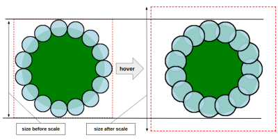
All that’s left to do is add the “pop out” effect on hover. For this, we are going first to update the gradient configuration, as illustrated in the following figure:

A figure illustrating how to update the gradient configuration by reducing the size of the larger circle and reducing the distance of the small circles

(Large preview)

We’re basically reducing the distance of the small circles, making them closer to the center. Then, we reduce the size of the larger circle as well. This produces an effect that appears to change the roundness of the smaller circles on hover.

The final trick is to scale the entire image element to make sure the size of the hovered shape is the same as the non-hovered shape. Scaling the image means that the avatar will get bigger and will pop out from the frame that we made smaller.

Two images before and after scaling. The one after scaling is bigger and popping out of the frame

(Large preview)
$n: 15; /* number of circles */

@property --i {
  syntax: "<length>";
  initial-value: 0px;
  inherits: true;
}

img {
  /* CSS variables */
  --r: 50px; /* controls the small circle radius and initial size */
  --f: 1.7; /* controls the scale factor */
  --c: #E4844A; /* controls the main color */
  
  $m: ();
  /* Sass loop */
  @for $i from 1 through ($n) {
    $m: append($m, 
      radial-gradient(var(--c) 70%, #0000 72%) no-repeat
      calc(50% + (50% - var(--i, 0px)) * cos(360deg * #{$i/$n} + var(--a, 0deg))) 
      calc(50% + (50% - var(--i, 0px)) * sin(360deg * #{$i/$n} + var(--a, 0deg))) /
      var(--r) var(--r), 
    comma);
  }

  mask: 
    linear-gradient(#000 0 0) top/100% 50% no-repeat,
    radial-gradient(var(--c) calc(72% - var(--r)/2 - var(--i, 0px)), #0000 0),
    $m;
  background:
    radial-gradient(var(--c) calc(72% - var(--r)/2 - var(--i, 0px)), #0000 0),
    $m;
  transition: --i .4s, scale .4s;
}

img:hover {
  --i: calc(var(--r)/var(--f));
  scale: calc((1 + 1/tan(180deg/#{$n}))/(1 - 2/var(--f) + 1/tan(180deg/#{$n})));
}

Here’s what’s changed:

  • The Sass loop that defines the position of the circle uses an equation of 50% - var(--i, 0px) instead of a value of 50%.
  • The larger circle uses the same variable, --i, to set the color stop of the main color in the gradients that are applied to the mask and background properties.
  • The --i variable is updated from 0px to a positive value. This way, the small circles move position while the large circle becomes smaller in size.
  • The --i variable is registered as a custom @property that allows us to interpolate its values on hover.

You may have noticed that I didn’t mention anything about the --f variable that’s defined on the image element. Truthfully, there is no special logic to it. I could have defined any positive value for the variable --i on hover, but I wanted a value that depends on --r, so I came up with a formula (var(--r) / var(--f)), where --f allows controls the scale.

Does the equation on the scale property on hover give you a little bit of panic? It sure looks complex, but I promise you it’s not. We divide the size of the initial shape (which is also the size of the element) by the size of the new shape to get the scale factor.

  • The initial size: calc(var(--r)*(1 + 1 / tan(180deg / #{$n})))
  • The size of the new shape: calc(var(--r) * (1 + 1 / tan(180deg / #{$n})) - 2 * var(--r) / var(--f))

I am skipping a lot of math details to not make the article lengthy, but feel free to comment on the article if you want more detail on the formulas I am using.

That’s all! We have a nice “pop out” effect on hover:

See the Pen [Fancy Pop Out hover effect!](https://codepen.io/t_afif/pen/qBQzrwq) by Temani Afif.

See the Pen Fancy Pop Out hover effect! by Temani Afif.

Wrapping Up

Does all of this seem a bit much? I see that and know this is a lot to throw at anyone in a single article. We’re working with some pretty new CSS features, so there’s definitely a learning curve with new syntaxes, not to mention some brushing up on math functions you probably haven’t seen in years.

But we learned a lot of stuff! We used gradients with some math to create a fancy shape that we applied as a mask and background. We introduced @property to animate CSS variables and bring our shape to life. We also learned a nice trick using animation-composition to control the speed of the rotation.

We still have a second part of this article where we will reuse the same CSS techniques to create a fancier hover effect, so stay tuned!

I’ll leave you with one last demo as a sign-off.

See the Pen [Pop out hover effect featuring Lea and Una](https://codepen.io/t_afif/pen/OJrLgeV) by Temani Afif.

See the Pen Pop out hover effect featuring Lea and Una by Temani Afif.
Smashing Editorial
(gg, yk)

10 Plugins to Manage Your Multi-Author WordPress Blog

High-quality content is the cornerstone of successful digital publishing. Inviting co-authors and guest contributors to your blog can substantially elevate both the quality and quantity of your content offerings. Yet, the task of managing a diverse team of writers, particularly those new to your platform’s guidelines, can be complex and time-consuming.

Thankfully, WordPress offers a wide array of plugins specifically designed to facilitate the management of multiple authors. Below is a curated list of exceptional WordPress plugins that aim to make author management more efficient and straightforward.

Editorial Calendar Plugin

Managing your blog’s posting schedule can be challenging, especially when WordPress lacks a built-in solution for tracking upcoming posts. The Editorial Calendar Plugin effectively fills this gap.

This plugin provides a calendar-based overview of your entire blog’s content pipeline, allowing you to see at a glance when each post is scheduled for publication. This simplifies your content planning process.

The plugin also offers robust management features. You can easily rearrange the schedule by dragging and dropping posts within the calendar. Quick edits to your articles can be made directly from this interface.

Author Box for Authors Plugin

The Author Box for Authors Plugin, also known as Molongui Authorship, gives due credit to your content authors. It features a responsive and customizable author box that automatically appears on your WordPress posts.

This plugin supports multiple authors for a single post, allowing you to credit everyone involved. It also includes a feature for guest authors, enabling you to add contributors without creating a WordPress account for them.

The plugin also allows you to change the position of the author box, modify its design to match your site’s aesthetics, and even add additional profile fields. It supports microdata for SEO and offers various layout options.

Co-Authors Plus Plugin

The Co-Authors Plus Plugin enables you to assign multiple authors to a single post, page, or custom post type through an intuitive search-as-you-type input box.

Each co-author gains visibility through their own archive page and feed. They also have the ability to edit posts with which they are associated. For contributors, editing is restricted to unpublished posts, aligning with WordPress’ core functionality.

A standout feature is the ability to add guest authors without requiring a WordPress user account. You can simply create a guest profile and assign it as you would any other byline.

WP User Frontend Plugin

The WP User Frontend Plugin enhances the frontend experience on your WordPress site. It offers a frontend dashboard, editor, and uploader, making it easier for users to manage their profiles, post submissions, and memberships.

This plugin allows for unlimited post-type form creation, enabling users to create new posts and edit their profiles directly from the frontend. This eliminates the need for backend access, making the process more user-friendly.

Admins can manage users from the frontend and configure backend access permissions. Additionally, the plugin supports featured image and image uploads from the frontend.

Post Pay Counter Plugin

The Post Pay Counter Plugin streamlines the payment process for authors on multi-author blogs. It allows you to set up payment criteria and then automatically calculates payments based on those criteria. The plugin provides both a general view of all users and a specific view for each author.

This plugin is useful for implementing a revenue-sharing or paid-to-write model. It supports various payment methods, including pay-per-post, pay-per-word, pay-per-visit, pay-per-image, and pay-per-comment. Payments can be calculated using either an incremental or zonal system.

Additional features include a date picker for selecting specific time ranges and customizable permissions to restrict user access to stats and functions.

User Access Manager Plugin

The User Access Manager Plugin aims to simplify the management of multiple authors in WordPress by allowing you, the admin, to customize the WordPress admin interface based on user roles.

This plugin enables you to selectively hide or display menu items, down to the sub-menu level. It also provides control over meta fields for both posts and pages.

You can tailor the admin interface for each user role, optimizing the backend header for more space and reorganizing the menu for logical navigation. This ensures a personalized and efficient admin experience for all users.

Adminimize Plugin

The Adminimize Plugin focuses on decluttering your WordPress dashboard. It allows you to hide specific menus and sub-menus, streamlining the interface for your authors.

The plugin also enables you to hide meta boxes and other elements in the post/page writing section, resulting in a cleaner, more focused writing environment.

This plugin is particularly useful for multi-author blogs where you aim to offer a simplified and efficient writing interface.

Simple Author Box Plugin

The Simple Author Box Plugin enhances your WordPress posts by adding a responsive author box at the end. This box displays the author’s name, gravatar, bio, and social media icons.

The plugin is highly customizable and supports over 30 social profile fields, which can be added to the WordPress user profile screen.

Additional features include the automatic insertion of the author box at the end of posts, as well as RTL, AMP support, and GDPR compatibility.

PublishPress Capabilities Plugin

The PublishPress Capabilities Plugin provides a robust solution for managing user roles and permissions on your WordPress site. Designed for both ease of use and powerful functionality, this user role editor is highly versatile.

You can manage all WordPress user roles, including custom roles, to ensure that each has the exact capabilities needed for your site. The plugin also allows you to customize the post editing screen, admin area, and user profile screens based on user roles.

User Role Editor Plugin

The User Role Editor Plugin for WordPress simplifies the management of user roles and capabilities. It allows admins to easily add or remove capabilities for any role by checking or unchecking boxes.

This plugin enables you to create new roles either from scratch or by copying existing ones. If a role becomes obsolete, you can delete it as long as no users are assigned to it. The plugin also allows you to change the default role assigned to new users.

It also has the ability to assign multiple roles to a single user. You can add new capabilities or remove ones that are no longer needed. The plugin offers multi-site support, making it a comprehensive solution for role management.

The post 10 Plugins to Manage Your Multi-Author WordPress Blog appeared first on Hongkiat.

The Path To Awesome CSS Easing With The linear() Function

The Path To Awesome CSS Easing With The linear() Function

The Path To Awesome CSS Easing With The linear() Function

Jhey Tompkins

2023-09-22T10:00:00+00:00
2023-09-26T22:06:10+00:00

To paraphrase a saying that has always stuck with me: “The best animation is that which goes unnoticed.” One of the most important concepts of motion design on the web is making motion “feel right.” At the same time, CSS has been fairly limited when it comes to creating animations and transitions that feel natural and are unobtrusive to the user experience.

Fortunately, that’s changing. Today, let’s look at new easing capabilities arriving in CSS. Specifically, I want to demonstrate the easing superpowers of linear() — a new easing function that is currently defined in the CSS Easing Level 2 specification in the Editor’s Draft. Together, we’ll explore its ability to craft custom easing curves that lead to natural-feeling UI movement.

The fact that linear() is in the Editor’s Draft status means we’re diving into something still taking shape and could change by the time it reaches the Candidate Recommendation. As you might imagine, that means linear() has limited support at this moment in time. It is supported in Chrome and Firefox, however, so be sure to bear that in mind as we get into some demos.

Before we jump straight in, there are a couple of articles I recommend checking out. They’ve really influenced how I approach UI motion design as a whole:

There are plenty of great resources for designing motion in UI, but those are two that I always keep within reach in my browser’s bookmarks, and they have certainly influenced this article.

The Current State Of Easing In CSS

We define CSS easing with either the animation-timing-function or transition-timing-function properties, depending on whether we are working with an animation or transition respectively.

Duration is all about timing, and timing has a big impact on the movement’s naturalness.

But, until recently, CSS has limited us to the following easing functions:

  • linear,
  • steps,
  • ease,
  • ease-in,
  • ease-out,
  • ease-in-out,
  • cubic-bezier().

For a refresher, check out this demo that shows the effect of different timings on how this car travels down the track.

See the Pen [Traditional CSS Easing Options [forked]](https://codepen.io/smashingmag/pen/PoXmRJQ) by Jhey.

See the Pen Traditional CSS Easing Options [forked] by Jhey.

The cubic-bezier() function has traditionally provided the most flexibility for creating easing with a little character. The site cubic-bezier.com is a great resource for creating bespoke easing functions. Otherwise, figuring out the exact curve values can be a chore.

This is the current state of easing in CSS. We’ll get to the shiny, new stuff in a bit. But first, I think it’s a good idea to revisit how easing functions influence easing behavior in curvatures.

Visualizing Easing Curves

We can visualize different easings with a graphical curve. The site easings.net does a good job of providing options that can be used with the cubic-bezier() timing function.

Easing curves which represent movement’s behavior

An easing curve represents the movement’s behavior. The left end is the start of the movement, and the segments in blue represent faster movement. (Large preview)

Easing curves can also be viewed in Chromium DevTools, allowing you to inspect any curve applied to a transition or animation.

A screenshot showing how to edit the curves

The curves are directly editable with the toggles on each endpoint. (Large preview)

Getting “Extra” Easing With linear()

But what if you need something a little extra than what’s available? For example, what about a bounce? Or a spring? These are the types of easing functions that we are unable to achieve with a cubic-bezier() curve.

This is where the new linear() easing function comes into play, pioneered by Jake Archibald and defined in the CSS Easing Level 2 specification, which is currently in the Editor’s Draft. MDN describes it well:

The linear() function defines a piecewise linear function that interpolates linearly between its points, allowing you to approximate more complex animations like bounce and elastic effects.

In other words, it’s a way to plot a graph with as many points as you like to define a custom easing curve. That’s pretty special and opens new possibilities we could not do before with CSS animations and transitions.

For example, the easing for a bounce could look like this:

:root {
  --bounce-easing: linear(
    0, 0.004, 0.016, 0.035, 0.063, 0.098, 0.141 13.6%, 0.25, 0.391, 0.563, 0.765,
    1, 0.891 40.9%, 0.848, 0.813, 0.785, 0.766, 0.754, 0.75, 0.754, 0.766, 0.785,
    0.813, 0.848, 0.891 68.2%, 1 72.7%, 0.973, 0.953, 0.941, 0.938, 0.941, 0.953,
    0.973, 1, 0.988, 0.984, 0.988, 1
  );
}

Here’s how that looks in action:

See the Pen [Bounce Easing 🏀 [forked]](https://codepen.io/smashingmag/pen/KKbmeeQ) by Jhey.

See the Pen Bounce Easing 🏀 [forked] by Jhey.

A gentle reminder that browser support is limited to Chrome and Firefox, so be sure to view the demo in one of those browsers. We’re only waiting on Safari at the moment, so we’re almost there!

“I’m not working all that out.”

That easing example sure looks like a lot of numbers plucked straight out of thin air, doesn’t it? As far as complexity goes, we’re looking at something that’s as scary as cubic-bezier() at first glance. The good thing is, once you’ve defined an ease, you’re unlikely to have to touch it again… at least for a while. It’s pretty much a set-it-and-forget-it sort of thing.

But how do we get the numbers in the first place? Jake, the clever mind behind linear(), put together an online generator that does all the heavy lifting for us. In fact, I got the easing values for the bounce demo straight from Jake’s handy tool. Here is a permalink to the output.

linear() generator app

linear() generator app. (Large preview)

Where’s All Of This Going?

For as long as I can remember, if I’ve needed some special easing for the work I’m doing, GreenSock has been my go-to solution. Its ease visualizer is one of my favorite examples of interactive documentation.

GreenSock’s Ease Visualizer which demonstrates different easing curves

GreenSock’s Ease Visualizer demonstrates different easing curves — including custom curves — and provides a snippet to use with its library. (Large preview)

As soon as I heard about the linear() function, my mind went straight to: “How can I convert GreenSock eases to CSS?” Imagine how awesome it would be to have access to a popular set of eases that can be used directly in CSS without reaching for JavaScript.

GreenSock’s visualizer accepts JavaScript or an SVG path. So, my first thought was to open DevTools, grab the SVG paths from the visualizer, and drop them into the tool. However, I encountered a hurdle because I needed to scale down the path coordinates for a viewBox of 0 0 1 1. GreenSock’s visualizer has a viewBox set to 0 0 500 500. I wrote a function to convert the coordinates and reverse the path to go in the right direction. Then, I reached out to Jake with some questions about the generator. The code is available on GitHub.

In my head, I thought the SVG route made sense. But, then I created a path that wouldn’t work in the tool. So, I reached back out to Jake, and we both thought the issue was a bug in the tool.

Jake then asked, “Why do you need to go via SVG?”. His question was spot on! The JavaScript input for the tool expects an easing function. An easing function maps time to a progress value. And we can get the easing functions straight out of GreenSock and pass them to the generator. Jake managed to dig the back easing function out of the GreenSock GitHub repo and create the easing I was originally after.

Generating GSAP Eases For CSS

Now that I’ve given you a bunch of context, we have all the parts of the puzzle we need to make something that can convert GSAP easing to CSS code.

First, we extract the parts from Jake’s linear() generator tool into a script. The idea is to loop over a set of keys and generate a block of CSS with linear() easings. GreenSock has a lovely utility method called parseEase. It takes a string and returns the easing function. The accepted strings are the GreenSock easing functions.

const ease = gsap.parseEase('power1.in')
ease(0.5) // === 0.25

As this loops over an object with different easing functions, we can pass them into the extracted code from the tool. We modify that extracted code to our needs.

const easings = ''
const simplified = 0.0025
const rounded = 4
const EASES = {
  'power-1--out': gsap.parseEase('power1.out')
  // Other eases
}
// Loop over the easing keys and generate results.
for (const key of Object.keys(EASES)) {
  // Pass the easing function through the linear-generator code.
  const result = processEase(key, EASES[key])
  const optimised = useOptimizedPoints(result.points, simplified, rounded)
  const linear = useLinearSyntax(optimised, rounded)
  const output = useFriendlyLinearCode(linear, result.name, 0)
  easings += output
}
// Generate an output CSS string.
let outputStart = ':root {'
let outputEnd = '}' 
let styles = `
  ${outputStart}
  ${easings}
  ${outputEnd}
`
// Write it to the body.
document.body.innerHTML = styles

The functions we extracted from the linear generator do different things:

  • processEase
    This is a modified version of processScriptData. It takes the easing functions and returns points for our graph.
  • useOptimizedPoints
    This optimizes those points based on the simplied and rounded values. This was where I learned about the Douglas Peucker algorithm from Jake.
  • useLinearSyntax
    This takes the optimized points and returns the values for the linear() function.
  • useFriendlyLinearCode
    This takes the linear values and returns a CSS string that we can use with the ease’s custom property name.

It’s worth noting that I’ve tried not to touch these too much. But it’s also worth digging in and dropping in a breakpoint or console.info at various spots to understand how things are working.

After running things, the result gives us CSS variables containing the linear() easing functions and values. The following example shows the elastic and bounce eases.

:root {
  --elastic-in: linear( 0, 0.0019 13.34%, -0.0056 27.76%, -0.0012 31.86%, 0.0147 39.29%, 0.0161 42.46%, 0.0039 46.74%, -0.0416 54.3%, -0.046 57.29%, -0.0357, -0.0122 61.67%, 0.1176 69.29%, 0.1302 70.79%, 0.1306 72.16%, 0.1088 74.09%, 0.059 75.99%, -0.0317 78.19%, -0.3151 83.8%, -0.3643 85.52%, -0.3726, -0.3705 87.06%, -0.3463, -0.2959 89.3%, -0.1144 91.51%, 0.7822 97.9%, 1 );
  --elastic-out: linear( 0, 0.2178 2.1%, 1.1144 8.49%, 1.2959 10.7%, 1.3463 11.81%, 1.3705 12.94%, 1.3726, 1.3643 14.48%, 1.3151 16.2%, 1.0317 21.81%, 0.941 24.01%, 0.8912 25.91%, 0.8694 27.84%, 0.8698 29.21%, 0.8824 30.71%, 1.0122 38.33%, 1.0357, 1.046 42.71%, 1.0416 45.7%, 0.9961 53.26%, 0.9839 57.54%, 0.9853 60.71%, 1.0012 68.14%, 1.0056 72.24%, 0.9981 86.66%, 1 );
  --elastic-in-out: linear( 0, -0.0028 13.88%, 0.0081 21.23%, 0.002 23.37%, -0.0208 27.14%, -0.023 28.64%, -0.0178, -0.0061 30.83%, 0.0588 34.64%, 0.0651 35.39%, 0.0653 36.07%, 0.0514, 0.0184 38.3%, -0.1687 42.21%, -0.1857 43.04%, -0.181 43.8%, -0.1297 44.93%, -0.0201 46.08%, 1.0518 54.2%, 1.1471, 1.1853 56.48%, 1.1821 57.25%, 1.1573 58.11%, 0.9709 62%, 0.9458, 0.9347 63.92%, 0.9349 64.61%, 0.9412 65.36%, 1.0061 69.17%, 1.0178, 1.023 71.36%, 1.0208 72.86%, 0.998 76.63%, 0.9919 78.77%, 1.0028 86.12%, 1 );
    --bounce-in: linear( 0, 0.0117, 0.0156, 0.0117, 0, 0.0273, 0.0468, 0.0586, 0.0625, 0.0586, 0.0468, 0.0273, 0 27.27%, 0.1093, 0.1875 36.36%, 0.2148, 0.2343, 0.2461, 0.25, 0.2461, 0.2344, 0.2148 52.28%, 0.1875 54.55%, 0.1095, 0, 0.2341, 0.4375, 0.6092, 0.75, 0.8593, 0.9375 90.91%, 0.9648, 0.9843, 0.9961, 1 );
  --bounce-out: linear( 0, 0.0039, 0.0157, 0.0352, 0.0625 9.09%, 0.1407, 0.25, 0.3908, 0.5625, 0.7654, 1, 0.8907, 0.8125 45.45%, 0.7852, 0.7657, 0.7539, 0.75, 0.7539, 0.7657, 0.7852, 0.8125 63.64%, 0.8905, 1 72.73%, 0.9727, 0.9532, 0.9414, 0.9375, 0.9414, 0.9531, 0.9726, 1, 0.9883, 0.9844, 0.9883, 1 );
  --bounce-in-out: linear( 0, 0.0078, 0, 0.0235, 0.0313, 0.0235, 0.0001 13.63%, 0.0549 15.92%, 0.0938, 0.1172, 0.125, 0.1172, 0.0939 27.26%, 0.0554 29.51%, 0.0003 31.82%, 0.2192, 0.3751 40.91%, 0.4332, 0.4734 45.8%, 0.4947 48.12%, 0.5027 51.35%, 0.5153 53.19%, 0.5437, 0.5868 57.58%, 0.6579, 0.7504 62.87%, 0.9999 68.19%, 0.9453, 0.9061, 0.8828, 0.875, 0.8828, 0.9063, 0.9451 84.08%, 0.9999 86.37%, 0.9765, 0.9688, 0.9765, 1, 0.9922, 1 );
}

We’re able to adjust this output to our heart’s desire with different keys or accuracy. The really cool thing is that we can now drop these GreenSock eases into CSS!

How To Get Your Very Own CSS linear() Ease

Here’s a little tool I put together. It allows you to select the type of animation you want, apply a linear() ease to it, and determine its speed. From there, flip the card over to view and copy the generated code.

See the Pen [GreenSock Easing with CSS linear() ⚡️ [forked]](https://codepen.io/smashingmag/pen/zYywLXB) by Jhey.

See the Pen GreenSock Easing with CSS linear() ⚡️ [forked] by Jhey.

In cases where linear() isn’t supported by a browser, we could use a fallback value for the ease using @supports:

:root {
  --ease: ease-in-out;
}
@supports(animation-timing-function: linear(0, 1)) {
  :root {
    --ease: var(--bounce-easing);
  }
}

And just for fun, here’s a demo that takes the GreenSock ease string as an input and gives you the linear() function back. Try something like elastic.out(1, 0.1) and see what happens!

See the Pen [Convert GSAP Ease to CSS linear() [forked]](https://codepen.io/smashingmag/pen/RwEVBmM) by Jhey.

See the Pen Convert GSAP Ease to CSS linear() [forked] by Jhey.

Bonus: Linear Eases For Tailwind

You don’t think we’d leave out those of you who use Tailwind, do you? Not a chance. In fact, extending Tailwind with our custom eases isn’t much trouble at all.

/** @type {import('tailwindcss').Config} */
const plugin = require('tailwindcss/plugin')
const EASES = {
  "power1-in": "linear( 0, 0.0039, 0.0156, 0.0352, 0.0625, 0.0977, 0.1407, 0.1914, 0.2499, 0.3164, 0.3906 62.5%, 0.5625, 0.7656, 1 )",
  /* Other eases */
}
const twease = plugin(
  function ({addUtilities, theme, e}) {
    const values = theme('transitionTimingFunction')
    var utilities = Object.entries(values).map(([key, value]) => {
      return {
        [`.${e(`animation-timing-${key}`)}`]: {animationTimingFunction: `${value}`},
      }
    })
    addUtilities(utilities)
  }
)
module.exports = {
  theme: {
    extend: {
      transitionTimingFunction: {
        ...EASES,
      }
    },
  },
  plugins: [twease],
}

I’ve put something together in Tailwind Play for you to see this in action and do some experimenting. This will give you classes like animation-timing-bounce-out and ease-bounce-out.

Conclusion

CSS has traditionally only provided limited control over the timing of animations and transitions. The only way to get the behavior we wanted was to reach for JavaScript solutions. Well, that’s soon going to change, thanks to the easing superpowers of the new linear() timing function that’s defined in the CSS Easing Level 2 draft specification. Be sure to drop those transitions into your demos, and I look forward to seeing what you do with them!

Stay awesome. ┬┴┬┴┤•ᴥ•ʔ├┬┴┬┴

Smashing Editorial
(gg, yk)

20 Best WordPress Job Board Themes and Plugins for 2023

Are you in the process of exploring online platforms to either secure freelance opportunities or to recruit qualified professionals? Job board websites serve as a digital marketplace where employers can list job openings and prospective employees can submit applications. With the increasing prevalence of WordPress-based job boards, a plethora of specialized WordPress themes and plugins have been meticulously crafted to cater to this niche.

If you are contemplating the development of a bespoke job board system utilizing WordPress, you have arrived at the appropriate article. We present a curated list of 20 premium and free WordPress job board themes and plugins to facilitate your endeavor.

50 Job Sites for Freelancers and Independent Professionals

.no-js #ref-block-post-6398 .ref-block__thumbnail { background-image: url(“https://assets.hongkiat.com/uploads/thumbs/250×160/50-freelance-job-sites-for-designers-programmers-best-of.jpg”); }

50 Job Sites for Freelancers and Independent Professionals

Being a freelancer can be extremely advantageous and is probably a dream for many designers and developers who… Read more

Overview:

WordPress Job Board Themes

Cariera
Cariera WordPress Theme

Designed for professionals, Cariera is a WordPress theme that is built on Automattic’s WP Job Manager. It serves as a comprehensive tool for both job seekers and employers.

The theme features a variety of job listing styles, in-depth analytics, a secure messaging system, and customizable dashboards tailored to different user roles. With a simple import, you can replicate the live demo site in just a few minutes.

Price: $79

Preview

Civi
Civi WordPress Theme

If you aim to build a streamlined job board, a freelance marketplace, or both using WordPress, Civi is an excellent choice. This theme allows you to effortlessly establish a fully-responsive job portal, thereby simplifying tasks related to human resource management, recruitment processes, and job listing management.

Price: $59

Preview

Jobtex
Jobtex WordPress Theme

Jobtex is a comprehensive WordPress theme designed to create job listing websites that are both functional and user-friendly. More than just a job board, it serves as a complete platform for HR management and recruitment.

The theme is fully responsive and provides a straightforward way to monetize your job portal. It is an ideal choice for those seeking an efficient job board solution.

Price: $59

Preview

Jobster
Jobster WordPress Theme

Jobster is a robust WordPress theme designed for creating job listing websites. With pre-designed demos at your disposal, launching your site becomes a breeze. The theme offers a rich set of features that are both powerful and user-friendly, providing you with limitless customization options.

It includes a variety of well-designed components, ranging from header sections to job displays and card layouts.

Price: $29

Preview

Careerfy
Careerfy WordPress Theme

Careerfy offers an advanced yet straightforward solution for displaying job listings on various types of websites. This WordPress theme enables you to access extensive job databases from major job boards, enriching your site with a wide array of job offers.

It features dedicated control panels for both employers and job seekers, automating many tasks. Some job providers even offer commissions for job link clicks originating from your site.

Price: $89

Preview

WorkScout
WorkScout WordPress Theme

WorkScout is a comprehensive WordPress theme designed for recruitment agencies, job offices, and employment services. This theme allows you to launch a polished, professional website in a short amount of time.

Price: $79

Preview

Jobhunt
Jobhunt WordPress Theme

Jobhunt is a user-friendly and efficiently coded WordPress theme that works seamlessly with WP Job Manager. It provides a full range of features, including searchable job listings, job submissions, and dedicated dashboards for employers.

The theme also supports additional functionalities through the WP Job Manager Core Add-on Bundle, such as resume management, job alerts, and integration with hiring platforms like Indeed.

Price: $59

Preview

JobScout
JobScout WordPress Theme

JobScout is a responsive WordPress theme designed for HR firms and recruitment agencies. It integrates seamlessly with the WP Job Manager plugin, adding job board features to your site. The theme is beginner-friendly, requiring no coding skills, and offers high customizability through an intuitive live customizer.

Price: Free

Preview

Job Portal
Job Portal WordPress Theme

Job Portal is a WordPress theme that offers both free access and premium features for building standout job portal websites. It allows easy customization via the WordPress customizer and is fully responsive, ensuring optimal display on various screen sizes.

The theme also supports drag-and-drop page building for effortless layout customization.

Price: Free

Preview

JobRoller
JobRoller WordPress Theme

JobRoller is a WordPress theme designed specifically for job boards. It features a range of monetization options for paid job listings and includes dedicated sections for blogs and landing pages.

The theme supports accounts for both employers and job seekers and offers a resume database, job submission forms, and Ajax-enabled search and filtering. Additionally, it comes with a variety of display settings and a comprehensive options panel for quick setup.

Price: $69

Preview

Careers
Careers WordPress Theme

Careers is a free WordPress theme designed for creating job boards and recruitment websites. With its well-structured layout, customization is straightforward. The theme comes pre-designed with a modern and professional look, requiring minimal adjustments.

It offers features like advanced search, animated stats, a testimonials section, and social media icons. The theme also includes blog pages for sharing valuable insights for both employers and job seekers.

Price: $19

Preview

JobEngine
JobEngine WordPress Theme

JobEngine is a WordPress theme aimed at creating robust job board websites. It features a welcoming front-page template and allows users to easily list jobs. The theme offers various monetization options, including charging for job listings or offering premium plans. It supports multiple payment gateways, such as PayPal and Stripe.

With extensive customization options, you can tailor the look of your job board using the built-in page builder. The theme is also translation-ready, making it suitable for multilingual platforms.

Price: $89

Preview

Comport
Comport WordPress Theme

Comport is a free, user-friendly WordPress theme designed for job listing websites. It features a modern, eye-catching design that is ready to use right out of the box but can also be easily customized to fit your specific needs.

The theme includes an advanced search bar, hover effects, a section for recent jobs, and a newsletter subscription box. It also features a testimonials slider and is optimized for search engines and mobile devices. Additionally, it comes with an active contact form and Google Maps integration.

Price: $19

Preview

WordPress Job Board Plugins

WP Job Manager
WP Job Manager Plugin

WP Job Manager – by Automattic – is a streamlined plugin that adds job board functionality to your WordPress website. Compatible with any theme through shortcodes and minimal CSS adjustments, it is easy to integrate.

The plugin allows you to add, manage, and sort job listings through an intuitive WordPress interface. It also features frontend forms for job submissions, live previews of listings, and options for job seekers to apply directly. Employers can manage their listings, while job seekers can receive alerts for new job postings via RSS.

Price: Free

Preview

Recruitly Addons
Recruitly Addons Plugin

Recruitly Addons is an extension designed for the Elementor page builder, aimed at simplifying the job posting process on WordPress websites. It eliminates the need for additional plugins, requiring only Elementor. Employers can easily post job vacancies, while job seekers can apply for roles that interest them.

The plugin offers eight distinct widgets, such as job lists and search panels, to assist applicants in their job hunt. Employers benefit from three categorization options – job sector, job type, and region – to better organize their listings. Additionally, the plugin supports multi-agency postings and allows each recruiter to specify their company details, ensuring that applications are sent directly to the appropriate company email.

Price: $27

Preview

Simple Job Board
Simple Job Board Plugin

Simple Job Board by PressTigers is a straightforward and lightweight WordPress plugin designed to add a job board to your site. It’s user-friendly and highly customizable, allowing you to manage a variety of job openings with ease. By using the shortcode [jobpost], you can display job listings on any page of your website.

The plugin also lets you tailor application forms for each job listing and add unique features to them. Plus, you have the option to annotate applications directly from your dashboard.

Price: Free

JobBoardWP
JobBoardWP Plugin

JobBoardWP is a user-friendly plugin that adds a comprehensive job board to your website. It features a clean and modern interface where job seekers can browse and search for jobs, while employers can post and manage job listings.

The plugin offers three key pages: a Jobs Page for listing jobs with search and filter options, a Post Job Page for job submissions that can be saved as drafts, and a Jobs Dashboard Page where users can manage their job listings, including editing and deleting posts.

Price: Free

Job Board Manager
Job Board Manager Plugin

Job Board Manager is designed to help you effortlessly create and manage a job board on your website. It comes with various shortcodes for displaying job archives, submission forms, and user accounts.

The plugin is SEO-optimized and follows schema.org markup standards. It features a tab-based account dashboard that can be customized using filter hooks, allowing you to add or display content as needed.

Price: Free

Preview

WP Job Openings
WP Job Openings Plugin

WP Job Openings is a straightforward yet robust plugin for adding a job listing section to your WordPress site. Designed based on extensive research on job listing layouts, the plugin offers two well-crafted layouts – Grid and List. It stands out for its highly customizable filter options, making the job search process more efficient for users.

Price: Free

Preview

easy.jobs
easy.jobs Plugin

easy.jobs is a SAAS-based recruitment solution that integrates seamlessly with WordPress and Elementor, offering a complete hiring platform right from your dashboard. It provides advanced filtering systems to evaluate candidates effectively. Whether you need a simple job board or a comprehensive hiring solution, easy.jobs offers a range of features to streamline the recruitment process.

Price: Free

The post 20 Best WordPress Job Board Themes and Plugins for 2023 appeared first on Hongkiat.

Revealing Images With CSS Mask Animations

Revealing Images With CSS Mask Animations

Revealing Images With CSS Mask Animations

Temani Afif

2023-09-15T07:00:00+00:00
2023-09-19T22:35:24+00:00

In a previous article, we explored fancy hover effects for images that involve shines, rotations, and 3D perspectives. We are going to continue playing with images, but this time, we are making animations that reveal images on hover. Specifically, we will learn about CSS masks and how they can be used to cover portions of an image that are revealed when the cursor hovers over the image.

Here is the HTML we will use for our work:

<img src="" alt="">

Yes, that’s right, only one image tag. The challenge I like to take on with each new CSS project is: Let CSS do all of the work without extra markup.

As we go, you may notice minor differences between the code I share in the article and what is used inside the demos. The code throughout the article reflects the CSS specification. But since browser support is inconsistent with some of the features we’re using, I include prefixed properties for broader support.

Example 1: Circle Reveal

In this first one, an image sits in a square container that is wiped away on hover to reveal the image.

See the Pen [Hover reveal animation using mask](https://codepen.io/smashingmag/pen/abQGGew) by Temani Afif.

See the Pen Hover reveal animation using mask by Temani Afif.

The first step for us is to create the image container and the gradient border around it. The container is actually a repeating linear gradient background set on the <img> tag. If we add a little amount of padding on the image, that allows the gradient background to show through.

img {
  padding: 10px;
  background: repeating-linear-gradient(45deg, #FF6B6B 0 10px, #4ECDC4 0 20px);
}

Two square images with striped gradient borders

Two square images with striped gradient borders. (Large preview)

So, we have two images, each with a gradient background that is revealed with a touch of padding. We could have added a <div> — or perhaps even a <figure> — to the markup to create a true container, but that goes against the challenge of letting CSS do all of the work.

While we were able to work around the need for extra markup, we now have to ask ourselves: How do we hide the image without affecting the gradient background? What we need is to hide the image but continue to show the padded area around it. Enter CSS masks.

It’s not terribly complicated to apply a mask to an element, but it’s a little trickier in this context. The “trick” is to chain two mask layers together and be more explicit about where the masks are applied:

img {
  /* etc. */
  mask:
    linear-gradient(#000 0 0) padding-box,
    linear-gradient(#000 0 0) content-box;
}

Now we have two masks “sources”:

  1. content-box: one that is restricted to the image’s content,
  2. padding-box: one that covers the whole image area, including the padded area.

We need two layers because then we can combine them with the CSS mask-composite property. We have different ways to combine mask layers with mask-composite, one of which is to “exclude” the area where the two masks overlap each other.

img {
  /* etc. */
  mask:
    linear-gradient(#000 0 0) padding-box,
    linear-gradient(#000 0 0) content-box;
  mask-composite: exclude;
}

This will make only the gradient visible (the padded area), as you can see below.

See the Pen [Overview of the exclude composition](https://codepen.io/smashingmag/pen/wvQOJrZ) by Temani Afif.

See the Pen Overview of the exclude composition by Temani Afif.

Notice that we can remove the padding-box from the code since, by default, a gradient covers the whole area, and this is what we need.

Are there other ways we could do this without mask-composite? There are many ways to hide the content box while showing only the padded area. Here is one approach using a conic-gradient as the mask:

mask:
  conic-gradient(from 90deg at 10px 10px, #0000 25%, #000 0)
  0 0 / calc(100% - 10px) calc(100% - 10px);
  /* 10px is the value of padding */

See the Pen [Border-only using conic-gradient](https://codepen.io/smashingmag/pen/vYQPxWr) by Temani Afif.

See the Pen Border-only using conic-gradient by Temani Afif.

There are others, of course, but I think you get the idea. The approach you choose is totally up to you. I personally think that using mask-composite is best since it doesn’t require us to know the padding value in advance or change it in more than one place. Plus, it’s a good chance to practice using mask-composite.

Now, let’s replace the second gradient (the one covering only the content area) with a radial-gradient. We want a circle swipe for the hover transition, after all.

img {
  mask:
    linear-gradient(#000 0 0),
    radial-gradient(#000 70%,#0000 71%) content-box;
  mask-composite: exclude;
}

See the Pen [Adding the radial-gradient](https://codepen.io/smashingmag/pen/wvQOJmb) by Temani Afif.

See the Pen Adding the radial-gradient by Temani Afif.

See that? The exclude mask composite creates a hole in the image. Let’s play with the size and position of that cutout and see what is happening. Specifically, I’m going to cut the size in half and position the circle in the center of the image:

mask:
  linear-gradient(#000 0 0),
  radial-gradient(#000 70%,#0000 71%) content-box
    center / 50% 50% no-repeat;
  mask-composite: exclude;

See the Pen [Updating the radial-gradient size and position](https://codepen.io/smashingmag/pen/YzRgZvj) by Temani Afif.

See the Pen Updating the radial-gradient size and position by Temani Afif.

I bet you can already see where this is going. We adjust the size of the radial-gradient to either hide the image (increase) or reveal the image (decrease). To fully hide the image, we need to scale the mask up to such an extent that the circle covers up the image. That means we need something greater than 100%. I did some boring math and found that 141% is the precise amount, but you could wing it with a round number if you’d like.

That gives us our final CSS for the effect:

img {
  padding: 10px; /* control the thickness of the gradient "border" */
  background: repeating-linear-gradient(45deg, #FF6B6B 0 10px, #4ECDC4 0 20px);
  mask:
    linear-gradient(#000 0 0),
    radial-gradient(#000 70%, #0000 71%) content-box
      50% / var(--_s, 150% 150%) no-repeat;
  mask-composite: exclude;
  transition: .5s;
}
img:hover {
  --_s: 0% 0%;
}

A few minor details:

  • We start with a size equal to 150% 150% to initially hide the image. I am taking the additional step of applying the size as a CSS variable (--_s) with the full size (150% 150%) as a fallback value. This way, all we need to do is update the variable on hover.
  • Add a hover state that decreases the size to zero so that the image is fully revealed.
  • Apply a slight transition of .5s to smooth out the hover effect.

Here’s the final demo one more time:

See the Pen [Hover reveal animation using mask](https://codepen.io/smashingmag/pen/abQGGew) by Temani Afif.

See the Pen Hover reveal animation using mask by Temani Afif.

We just created a nice reveal animation with only a few lines of CSS — and no additional markup! We didn’t even need to resort to pseudo-elements. And this is merely one way to configure things. For example, we could play with the mask’s position to create a slick variation of the effect:

See the Pen [Another variation of the circular reveal animation](https://codepen.io/smashingmag/pen/dyQrvEq) by Temani Afif.

See the Pen Another variation of the circular reveal animation by Temani Afif.

I’m a big fan of putting an idea out there and pushing it forward with more experiments. Fork the demo and let me know what interesting things you can make out of it!

Example 2: Diagonal Reveal

Let’s increase the difficulty and try to create a hover effect that needs three gradients instead of two.

See the Pen [Hover reveal animation using mask II](https://codepen.io/smashingmag/pen/qBQKMKa) by Temani Afif.

See the Pen Hover reveal animation using mask II by Temani Afif.

Don’t look at the code just yet. Let’s try to create it step-by-step, starting with a simpler effect that follows the same pattern we created in the first example. The difference is that we’re swapping the radial-gradient with a linear-gradient:

img {
  padding: 10px; /* control the thickness of the gradient "border" */
  background: repeating-linear-gradient(45deg, #FF6B6B 0 10px, #4ECDC4 0 20px);
  mask:
    linear-gradient(#000 0 0),
    linear-gradient(135deg, #000 50%, #0000 0) content-box 
      0% 0% / 200% 200% no-repeat;
  mask-composite: exclude;
  transition: .5s;
}
img:hover {
  mask-position: 100% 100%;
    }

You’ll notice that the other minor difference between this CSS and the first example is that the size of the mask is equal to 200% 200%. Also, this time, the mask’s position is updated on hover instead of its size, going from 0% 0% (top-left) to 100% 100% (bottom-right) to create a swiping effect.

See the Pen [Diagonal reveal animation using mask](https://codepen.io/smashingmag/pen/OJaqmWV) by Temani Afif.

See the Pen Diagonal reveal animation using mask by Temani Afif.

We can change the swipe direction merely by reversing the linear gradient angle from 135deg to -45deg, then updating the position to 0% 0% on hover instead of 100% 100%:

img {
  padding: 10px; /* control the thickness of the gradient "border" */
  background: repeating-linear-gradient(45deg, #FF6B6B 0 10px, #4ECDC4 0 20px);
  mask:
    linear-gradient(#000 0 0),
    linear-gradient(-45deg, #000 50%, #0000 0) content-box 
      100% 100% / 200% 200% no-repeat;
  mask-composite: exclude;
  transition: .5s;
}
img:hover {
  mask-position: 0% 0%;
}

See the Pen [Diagonal reveal animation using mask](https://codepen.io/smashingmag/pen/ZEmPaYM) by Temani Afif.

See the Pen Diagonal reveal animation using mask by Temani Afif.

One more thing: I defined only one mask-position value on hover, but we have two gradients. If you’re wondering how that works, the mask’s position applies to the first gradient, but since a gradient occupies the full area it is applied to, it cannot be moved with percentage values. That means we can safely define only one value for both gradients, and it will affect only the second gradient. I explain this idea much more thoroughly in this Stack Overflow answer. The answer discusses background-position, but the same logic applies to mask-position.

Next, I’d like to try to combine the last two effects we created. Check the demo below to understand how I want the combination to work:

See the Pen [Combination of two diagonal reveal](https://codepen.io/smashingmag/pen/OJaqOym) by Temani Afif.

See the Pen Combination of two diagonal reveal by Temani Afif.

This time, both gradients start at the center (50% 50%). The first gradient hides the top-left part of the image, while the second gradient hides the bottom-right part of it. On hover, both gradients slide in the opposite direction to reveal the full image.

If you’re like me, you’re probably thinking: Add all the gradients together, and we’re done. Yes, that is the most intuitive solution, and it would look like this:

img {
  padding: 10px; /* control the thickness of the gradient "border" */
  background: repeating-linear-gradient(45deg, #FF6B6B 0 10px, #4ECDC4 0 20px);
  mask:
    linear-gradient(#000 0 0),
    linear-gradient(135deg, #000 50%, #0000 0) content-box 
      50% 50% / 200% 200% no-repeat,
    linear-gradient(-45deg, #000 50%, #0000 0) content-box 
      50% 50 / 200% 200% no-repeat;
  mask-composite: exclude;
  transition: .5s;
  cursor: pointer;
}
img:hover {
  mask-position: 0% 0%, 100% 100%;
}

See the Pen [Combining both effects](https://codepen.io/smashingmag/pen/qBQvVPd) by Temani Afif.

See the Pen Combining both effects by Temani Afif.

This approach kind of works, but we have a small visual glitch. Notice how a strange diagonal line is visible due to the nature of gradients and issues with anti-aliasing. We can try to fix this by increasing the percentage slightly to 50.5% instead of 50%:

See the Pen [Trying to fix the anti-aliasing issue](https://codepen.io/smashingmag/pen/ZEmPaXP) by Temani Afif.

See the Pen Trying to fix the anti-aliasing issue by Temani Afif.

Yikes, that makes it even worse. You are probably wondering if I should decrease the percentage instead of increasing it. Try it, and the same thing happens.

The fix is to update the mask-composite property. If you recall, we are already using the exclude value. Instead of declaring exclude alone, we need to also apply the add value to make sure the bottom layers (the swiping gradients) aren’t excluded from each other but are instead added together:

img {
  mask:
    /* 1st layer */
    linear-gradient(#000 0 0),

    /* 2nd layer */
    linear-gradient(135deg, #000 50.5%, #0000 0) content-box 
      50% 50% / 200% 200% no-repeat,

    /* 3rd layer */
    linear-gradient(-45deg, #000 50.5%, #0000 0) content-box 
      50% 50% / 200% 200% no-repeat;

  mask-composite: exclude, add;
}

Now, the second and third layers will use the add composition to create an intermediate layer that will be excluded from the first one. In other words, we must exclude all the layers from the first one.

I know mask-composite is a convoluted concept. I highly recommend you read Ana Tudor’s crash course on mask composition for a deeper and more thorough explanation of how the mask-composite property works with multiple layers.

This fixes the line issue in our hover effect:

See the Pen [Diagonal reveal animation using mask](https://codepen.io/smashingmag/pen/zYMbPLY) by Temani Afif.

See the Pen Diagonal reveal animation using mask by Temani Afif.

One more small detail you may have spotted: we have defined three gradients in the code but only two mask-position values on the hover state:

img:hover {
  mask-position: 0% 0%, 100% 100%;
}

The first value (0% 0%) is applied to the first gradient layer; it won’t move as it did before. The second value (100% 100%) is applied to the second gradient layer. Meanwhile, the third gradient layer uses the first value! When fewer values are declared on mask-position than the number of mask layers, the series of comma-separated values repeats until all of the mask layers are accounted for.

In this case, the series repeats circles back to the first value (0% 0%) to ensure the third mask layer takes a value. So, really, the code above is a more succinct equivalent to writing this:

img:hover {
  mask-position: 0% 0%, 100% 100%, 0% 0%;
}

Here is the final demo again with both variations. You will see that the second example uses the same code with minor updates.

See the Pen [Hover reveal animation using mask II](https://codepen.io/smashingmag/pen/qBQKMKa) by Temani Afif.

See the Pen Hover reveal animation using mask II by Temani Afif.

Example 3: Zig-Zag Reveal

I have one more example for you, this time revealing the image with zig-zag edges sliding apart, sort of like teeth chomping on the image.

See the Pen [Hover reveal animation using mask III](https://codepen.io/smashingmag/pen/vYQaLaZ) by Temani Afif.

See the Pen Hover reveal animation using mask III by Temani Afif.

While this may look like a more complex hover effect than the last two we covered, it still uses the same underlying CSS pattern we’ve used all along. In fact, I’m not even going to dive into the code as I want you to reverse-engineer it using what you now know about using CSS gradients as masks and combining mask layers with mask-composite.

I won’t give you the answer, but I will share an article I wrote that demonstrates how I created the zig-zag shape. And since I’m feeling generous, I’ll link up this online border generator as another resource.

Wrapping Up

I hope you enjoyed this little experiment with CSS masks and gradients! Gradients can be confusing, but mixing them with masks is nothing short of complicated. But after spending the time it takes to look at three examples in pieces, we can clearly see how gradients can be used as masks as well as how we can combine them to “draw” visible areas.

Once we have an idea of how that works, it’s amazing that all we need to do to get the effect is update either the mask’s position or size on the element’s hover state. And the fact that we can accomplish all of this with a single HTML element shows just how powerful CSS is.

We saw how the same general CSS pattern can be tweaked to generate countless variations of the same effect. I thought I’d end this article with a few more examples for you to play with.

See the Pen [Hover reveal animation using mask IV](https://codepen.io/smashingmag/pen/PoxLMOy) by Temani Afif.

See the Pen Hover reveal animation using mask IV by Temani Afif.

See the Pen [Hover reveal animation using mask V](https://codepen.io/smashingmag/pen/jOQJgxN) by Temani Afif.

See the Pen Hover reveal animation using mask V by Temani Afif.

See the Pen [Hover reveal animation using mask VI](https://codepen.io/smashingmag/pen/gOQEVdQ) by Temani Afif.

See the Pen Hover reveal animation using mask VI by Temani Afif.

Further Reading on Smashing Magazine

Smashing Editorial
(gg, yk, il)

Gradients, Blend Modes, And A Really Cool Hover Effect


Gradients, Blend Modes, And A Really Cool Hover Effect

Gradients, Blend Modes, And A Really Cool Hover Effect

Preethi Sam


Do you know how box-shadow is sometimes used as a hover effect? It adds depth to something, like a button, and can create the impression that it is being pressed into the page.

See the Pen [Untitled [forked]](https://codepen.io/smashingmag/pen/eYbmovv) by Geoff Graham.

See the Pen Untitled [forked] by Geoff Graham.

Gradients are also capable of adding depth. They are often used to make something appear as if it’s popping off the page.

See the Pen [Untitled [forked]](https://codepen.io/smashingmag/pen/yLGyrvg) by Geoff Graham.

See the Pen Untitled [forked] by Geoff Graham.

I wanted to see if a gradient could make for an interesting hover effect. Not exactly like a button with a box shadow, but maybe it can be done in a way that changes an element’s state in addition to other elements around it.

Here’s what I’m thinking:

See the Pen [Gradient Hover [forked]](https://codepen.io/smashingmag/pen/JjwoVpZ) by Preethi Sam.

See the Pen Gradient Hover [forked] by Preethi Sam.

See that? The hover state is on one of the items, but all items are affected by the change. The hovered element has the darkest, boldest background, while a gradient covers the rest of the items and de-emphasizes them with lighter shades of the same color.

Now, I’ll immediately point out that hover states should rely on more than changing colors to indicate a change. That demo is purely meant to showcase the effect, but I would consider additional visual cues if I were using this in production.

But let’s break this apart to see how it works. I think it’s interesting because we will get into :nth-of-type() recipes and sibling selectors to pull this off.

Here’s the HTML:

<section>
  <div></div>
  <div></div>
  <div</div>
  <div></div>
  <div></div>
  <div><!-- backdrop --></div>
</section>

We have six divs in a <section> container. The first five divs are the interactive elements, and the last one will hold the gradient that covers them. I’m going to start by setting up the container:

section {
  position: relative;
  width: min(90vw, 400px);
}

I know I will have to use absolute positioning on the gradient later, so I’m preemptively setting the container to relative positioning. Hence, the gradient stays scoped to the section’s boundaries. Otherwise, the gradient would be entirely out of the document flow and wind up in some unexpected place. The width? Purely subjective.

Those first five divs share the same general appearance. We can select and style all of them at once without selecting the last div using the :not() pseudo-selector:

div:not(:last-of-type) {
  height: 40px;   
  background-color: rgb(0 128 0);
  border-block: 5px #fff solid;
}

There are a couple of things to note here. One is that we can make this a little more maintainable by storing some of the values as CSS variables:

section {
  --c1: hsl(0 0% 0%); /* Black base color */
  --bg-color: rgb(0 128 0); /* Green */
  --height: 40px;
  --border: 5px white solid;
}

/* Style all divs but the last one */
div:not(:last-of-type) {
  height: var(--height);   
  background-color: var(--bg-color);
  border-block: var(--border);
  mix-blend-mode: screen;
}

The other is that I’ve added white top and bottom borders to the divs. That’s how I’m faking space between them, which is essential for how the background color blends with the gradient later (which is what mix-blend-mode handles). I really only need those white borders on the middle three divs since the first and fifth divs are sort of like borders that start and end the container.

div:nth-of-type(1) {
  border-block-start: 0;
}
div:nth-of-type(5) {
  border-block-end: 0;
}

Now we can turn to the last div with the gradient:

div:last-of-type {
  background: lightgrey;
  inset-block-start: 0;
  height: 100%;
  position: absolute;
  width: inherit;
  z-index: -1;
}

Wait, what? There’s the absolute positioning I mentioned earlier, but you’re probably wondering why there’s no gradient. We’ll get there. Initially, we want a solid background color because the gradient only comes into play when a hover occurs. And when it does, it will be a linear gradient that goes from black to near-white that will blend with the background color of the first five divs.

Here’s what we have so far:

See the Pen [–i-m-Gradient Hover [forked]](https://codepen.io/smashingmag/pen/JjwoqBP) by Preethi Sam.

See the Pen –i-m-Gradient Hover [forked] by Preethi Sam.

The arrangement of the colors and the gradient height will be based on the height and spacing between the divs and the location of the hovered div. Since there will be some repeating values, we’ll use more CSS variables to store them.

section {
  --c1: hsl(0 0% 0%); /* Black base color */
  --c2: hsl(0deg 0% 20%); /* This and the rest are grays */
  --c3: hsl(0deg 0% 40%);
  --c4: hsl(0deg 0% 60%);
  --c5: hsl(0deg 0% 80%);
  --bars: 5;
  --color-stop: calc(100% / var(--bars));
  --bg-color: rgb(0, 128, 0); /* Green */
  --height: 40px;
  --border: 5px white solid;

  /* etc. */
}

Those are the colors we want to apply to the gradient. You don’t have to have all of these same colors. You could, for example, use the same black variable we set up earlier for all the colors, then apply a different alpha transparency to each instance. But notice how I’ve also created two other variables:

  • --bars
    This is the number of divs in the container minus the last one.
  • --color-stop
    This divides the full height of the gradient by the number of --bars. I plan on multiplying this calculation by the order of each color stop (e.g., 2 for the second color stop). This way, there’s no need for hardcoded magic numbers because the calculation is based on the number of divs in the container.

Here’s where the rubber meets the road. We need to define the gradient, then apply it when a particular div is hovered. Here’s how it looks when the first div is in a hovered state:

div:nth-of-type(1):hover ~ div:last-of-type {
  background: linear-gradient(
    var(--c1) var(--color-stop), 
    var(--c2) var(--color-stop), 
    var(--c2) calc(var(--color-stop) * 2), 
    var(--c3) calc(var(--color-stop) * 2), 
    var(--c3) calc(var(--color-stop) * 3), 
    var(--c4) calc(var(--color-stop) * 3), 
    var(--c4) calc(var(--color-stop) * 4), 
    var(--c4) calc(var(--color-stop) * 4));
}

That selector might look slightly confusing initially, but it’s essentially saying: “Hey, when the first div is hovered, apply these styles to the last div.”

Go ahead and hover the first div to see how this plays out:

See the Pen [Gradient Hover: First Div [forked]](https://codepen.io/smashingmag/pen/qBLEGJB) by Geoff Graham.

See the Pen Gradient Hover: First Div [forked] by Geoff Graham.

All that’s left is to wash, rinse, and repeat. We need to do the same thing for the next four divs in the container. The tricky part is that we need to adjust the color stops so that the darkest shades of the gradient overlay the hovered div. Let’s look at the second div for an example:

div:nth-of-type(2):hover ~ div:last-of-type {
  background: linear-gradient(
    var(--c2) var(--color-stop), 
    var(--c1) var(--color-stop), 
    var(--c1) calc(var(--color-stop) * 2), 
    var(--c2) calc(var(--color-stop) * 2), 
    var(--c2) calc(var(--color-stop) * 3), 
    var(--c3) calc(var(--color-stop) * 3), 
    var(--c3) calc(var(--color-stop) * 4), 
    var(--c4) calc(var(--color-stop) * 4));
}

All we’re really doing is changing the order of color variables! The --c1 color variable merely shifts down a level, allowing the lighter shades of the gradient to surround it.

Showing two different color stop positions side-by-side

Showing two different color stop positions side-by-side. (Large preview)

Let’s pull it all together:

See the Pen [Gradient Hover [forked]](https://codepen.io/smashingmag/pen/JjwoVpZ) by Preethi Sam.

See the Pen Gradient Hover [forked] by Preethi Sam.

Have fun with this! Try different colors and different gradations. Here’s another example where the gradient is applied to text elements:

See the Pen [Gradient Hover 2 [forked]](https://codepen.io/smashingmag/pen/abPzrQe) by Preethi Sam.

See the Pen Gradient Hover 2 [forked] by Preethi Sam.

Aesthetics aside, remember to use designs, layouts, and colors that make it clear to users that they are interacting with the element and what that interaction does.

Further Reading On SmashingMag

Smashing Editorial
(gg, yk, il)