jQuery is undoubtedly the most popular JavaScript library. Almost every website on the planet uses it. Due to its widespread use, jQuery includes functionalities to cover every possible scenario.
However, when working on a simple website, we might only use a few of these functions. It would be more efficient to run only the necessary functions and exclude the unused ones. We can exclude certain jQuery modules that aren’t needed for our project. Let’s explore how to do this.
Getting Started
First, we need to install essential tools for the task. These tools include Git, Grunt, and Node.js. If you’re using macOS, the most straightforward method to install these tools is through the macOS package manager, Homebrew.
Installing Homebrew
Open your Terminal and execute the following command to install Homebrew. With Homebrew, installing the other tools becomes simpler.
This refers to functions that apply animation effects, such as .slideToggle(), .animate(), and .fadeIn().
Offset
-offset
This pertains to functions that retrieve coordinates and position, including .offset() and .position().
Before customizing jQuery, we need to clone it from the GitHub repository. Execute the following command in the Terminal:
git clone git://github.com/jquery/jquery.git
A new folder named jquery will be created in your user directory. Navigate to this directory with the command:
cd jquery
Next, install the Node dependency modules required for our project:
npm install
Then, build jQuery by simply executing the Grunt command:
grunt
If successful, the following report will be displayed:
As indicated in the report, our jQuery is stored in the dist/ folder. At this stage, our jQuery includes all functionalities, resulting in a size of 265kb. The minified version is 83kb.
Module Removal
If you wish to remove the Effects module from jQuery, execute the following command:
grunt custom:-effects
Upon checking the file size again, you’ll notice it has reduced to 246kb.
To exclude multiple modules, list each module separated by a comma, like so:
grunt custom:-effects,-ajax,-deprecated
Excluding multiple modules will further reduce the jQuery file size. In this instance, it’s been reduced to just 207kb.
Concluding Thoughts
jQuery facilitates easy DOM manipulation, but its size, exceeding 200kb, might impact your website’s performance. By removing unnecessary jQuery modules, your script will undoubtedly run more efficiently and faster. We hope this tip proves beneficial for your upcoming projects.
Let’s talk about progress indicators — or loaders. It’s true that there are so many tutorials about them and even more examples floating around CodePen. There was a time just a couple of years ago when loaders seemed to be the go-to example for framework documentation, next to to-do apps.
I recently had the task of creating the loading state for a project, so naturally, I looked to CodePen for inspiration. What I wanted was a circular shape, and there is no shortage of examples. In many cases, the approach is some combination of using the CSS border-radius property to get a circular shape and @keyframes to spin it from 0deg to 360deg.
I needed a little more than that. Specifically, I needed a donut shape that fills in the progress indicator as it goes from 0% to 100%. Thankfully, I found great donut examples I could use for inspiration and several different approaches. For example, I could use the “trick” of an SVG with a stroke that animates with a combination of stroke-dasharray and stroke-dashoffset. Temani Afif has hundreds of examples that use a combination of CSS gradients and masks.
There was still more that I needed. What I really wanted was a donut progress indicator that not only fills in as the progress increases but sets a visual on it that moves with the progress. In other words, I wanted to make it look like an object is traveling around the donut, leaving a trail of progress behind.
See the Pen [Circular animation with offset Pt. 1 [forked]](https://codepen.io/smashingmag/pen/vYvrwXo) by Preethi Sam.
See that? The scooter has a circular track that fills in with a gradient as it moves around the shape. If you’re using Firefox, you likely will have trouble with the demo because it relies on a custom @property that Firefox doesn’t support yet. However, it is supported in the Nightly version, so perhaps we have full support to look forward to soon.
In the end, I wound up combining several of the techniques I found and some additional considerations. I thought I would share the approach because I like demonstrating how various ideas can come together to create something different. This demo uses animated custom properties, a conic gradient, CSS offset, and emoji to produce the effect. The truth is that you may find a different combination or set of techniques that get the job done or fit your requirements better. This is more of a thinking exercise.
Creating The Donut
Circles in CSS are fairly straightforward. We could draw one in SVG and forget CSS entirely. That’s a valid approach, but I’m comfortable working directly in CSS for this sort of thing. We start with a single element in the HTML:
<div class="progress-circle"></div>
From here, we set the circle’s dimensions. That can be done by declaring a width and using an aspect-ratio to maintain a perfect one-to-one shape.
That’s our shape! We won’t see anything yet, of course, because we haven’t filled it in with color. Let’s do that now with a conic-gradient. We want one of those because the gradient moves in a circular direction by default, starting at 0% and completing a full circle at 360deg.
What we’re looking at is pretty much a pie chart, right? We’ve established a circular shape and filled it in with a conical gradient that starts with red and hits a hard color stop at #eee, filling in the rest of the pie in a light gray.
The pie is delicious, but we’re aiming for a donut, and donuts have a hole cut out of the center. In the true spirit of CSS, there are different ways to approach this. Again, Temani has demonstrated time and again how CSS masks can do cut-outs. It’s a clean approach, too, because we can repurpose the same conical gradient to cut a circle from the center, only changing the color values to mask out the part we want to hide.
I went a different route, partly for convenience and partly for the sake of demonstrating how CSS is capable of approaching challenges in multiple ways. So, you may even find yourself going with a different route than what we’re demonstrating here. My approach is to use the ::before pseudo-element of the .progress-circle. We lay it on top of the conical gradient with absolute positioning, fill it with a solid color, and size it so it eclipses part of the main shape. It’s basically a smaller solid-colored circle on top of a larger gradient-filled circle.
Notice what we’re doing to position the smaller circle. Since we’re working with ::before, we need the CSS content property to make it display, even with an empty value. From there, we’re using absolute positioning, setting the smaller circle towards the center with an inset applied in all directions. We’re able to inherit the larger circle’s border-radius before setting a solid background color. We can’t forget to set relative positioning on the larger circle to (a) set a stacking context and (b) keep the smaller circle within the larger circle’s bounds.
See the Pen [conic-gradient() [forked]](https://codepen.io/smashingmag/pen/GRPGzjg) by Preethi Sam.
That’s it for the donut! We accomplished it purely in CSS, relying on a combination of the border-radius property, a conic-gradient, and a well-positioned ::before pseudo-elmement.
Animating The Progress
Have you worked with custom CSS properties? I’m not simply referring to defining --some-variable with a value, but using @property to register a property with a custom syntax. It’s magic how it allows us to interpolate between values that we are normally unable to, such as color and angle values in gradients.
When we register a CSS custom property, we have to mention what its type is, for instance, whether the value is a <length>, <number>, <color> or any of the 11 other types that are supported at the time I’m writing this. This way, the browser understands what sort of value it is working with, and when the time arises, it can update the variable’s value for an animation.
I’m going to register a custom property called --p, which is short for its syntax, <percentage>, with an initial value of 10% that will be the “starting” point for the progress indicator.
Now, we can use the --p variable where we need it, such as where the hard color stops between red and #eee in the larger circle’s conical gradient that we’re using as the starting point.
We want to transition from the custom property’s initial value, 10%, to a larger percentage in order to move the gradient’s hard color stop around the shape. So, let’s set up a CSS transition that is designed to update the value of --p.
We’re going to update the value on hover, transitioning from 10% to 80%:
.progress-circle:hover{
  --p: 80%;
}
One more small adjustment: I like to update the cursor on hover so that it’s clearer what sort of interaction the user is dealing with. In this case, we’re working with something indicating progress, so that’s how we’ll configure it:
Our circle is done! We can now hover over the element, and the conical gradient’s hard color stops transitions from 10% to 80% behind the smaller circle that is hiding the rest of the gradient to imply a donut shape. We registered a custom @property with an initial value, applied it to the gradient, and updated the value on hover.
Moving Around The Circle
The final part of this exercise is to work on the progress indicator. We’re using the gradient to indicate progress, but I want the additional visual aid of an object that travels around the larger circle with the gradient as it transitions values.
The idea I had was a little scooter that appears to leave a gradient trail behind it. We already have the circle and the gradient, so all we need is the scooter and a way to make it use the larger circle as a track to drive around.
See the Pen [CSS offset animation [forked]](https://codepen.io/smashingmag/pen/NWezoyg) by Preethi Sam.
If we had decided to create the initial donut shape with SVG, then we could have used the same path we used for the larger circle as the track. However, we can still get the same path-making powers in CSS using the offset-path property. It’s so much like writing SVG in CSS that we can actually use the exact same coordinates for an SVG circle in the path():
SVG path coordinates are difficult to read, but this is what we’re doing in this particular path:
M 100, 0: This moves the position of the starting point on an X-Y coordinate system, where 100 is along the X-axis and equal to the larger circle’s radius, or one-half of its width, 200px. The starting point is set to 0 on the Y-axis, placing it at the top of the shape. So, we’re starting at the top-center of the larger circle.
a 100 100: This sets an arc with horizontal and vertical radii of 100, giving us a new circle. Even though we won’t technically see the circle, it is drawn in there, providing the scooter with an invisible track that follows the shape of the larger circle.
One more thing! We have a starting point for the scooter, thanks to the coordinates in the offset-path. The CSS offset-distance property lets us define the end point where we plan to offset the scooter, which is exactly equal to the --p custom property.
We’re already updating our custom --p property on hover to help move the conical gradient’s hard stop position from an initial value of 10% to 80%. We should do the same for the scooter so they move together.
I’m using the child combinator (>) since the indicator is a direct child of the circle. If your design includes additional elements or requires the scooter to be a further descendant, then you might consider a general descendant selector instead.
The Final Result
Here’s everything we covered in a single CSS snippet. I’ve cleaned things up a tiny bit, such as setting up variables for recurring values, like the --size of the circle.
/* Custom property */
@property --p {
  syntax: '<percentage>';
  inherits: false;
  initial-value: 10%;
}

/* Large circle */
.progress-circle {
  --size: 200px;
  --p: 10%; /* fallback for no @property support */

  background: conic-gradient(red calc(-60% + var(--p)), rgb(224, 187, 77) var(--p), #eee 0);
  border-radius: 50%;
  position: relative;
  margin: auto;
  cursor: progress;
}

/* Small circle pseudo-element */
.progress-circle::before {
  content:'Going ten to eighty percent';
  position: absolute;
  inset: 20px;
  text-align: center;
  padding: 50px;
  font: italic 9pt 'Enriqueta';
  border-radius: inherit;
  background: white;
}

/* The scooter track */
.progress-indicator {
    --size: min-content;
    offset: path("M 100,0 a 100 100 0 1 1 -.1 0 z");
    offset-distance: var(--p);
    font: 43pt serif;
    transform: rotateY(180deg) translateX(-6px);
}

/* Update initial value on :hover */
.progress-circle:hover,
.progress-circle:hover > .progress-indicator {
  --p: 80%;
}

/* Controls the width of larger circle and scooter track */
.progress-circle,
.progress-indicator {
    width: var(--size);
    transition: --p 2s linear;
}
See the Pen [Circular animation with offset Pt. 1 [forked]](https://codepen.io/smashingmag/pen/vYvrwXo) by Preethi Sam.
I’ve been referring to this component as both a “progress indicator” and a “loader” throughout the article. There is a difference between displaying progress and loading states, but it’s also possible for a loading state to display the loading progress. That’s why I’m using a generic <div> as a <figure> in the example, but you could just as well use it on more semantic HTML elements, like <progress> or <meter> depending on your specific use case. For accessibility, you might consider incorporating descriptive text that can be announced as assistive-technology-friendly sentences that describe the data.
Let me know if you use this on a project and how you approach it. Share it with me in the comments, and we can compare notes.
The last time we met, I demonstrated how newer CSS features — particularly trigonometric functions — can be leveraged to accomplish a “pop-out” hover effect. This is what we made together:
See the Pen [Fancy Pop Out hover effect!](https://codepen.io/t_afif/pen/qBQzrwq) by Temani Afif.
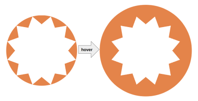
We are going to redo the demo but with a different shape. Rather than the rounded floral pattern for the frame that the avatar pops out of, we’ll make a starburst pattern instead.
See the Pen [Fancy Pop Out hover effect!](https://codepen.io/t_afif/pen/mdawrLa) by Temani Afif.
We are going to rely on the same concepts to create this effect, so you will definitely want to read the first part of this little series before continuing. This is more of an opportunity to practice what we learned in a new context. We will still use CSS masks to “draw” the shape with gradients, trigonometric functions, and custom properties.
Drawing The Shape
Creating a starburst shape is a relatively “easy” thing we can create in CSS. People have accomplished it for years with a combination of pseudo-elements with transforms. An updated approach is to use the clip-path property to draw a polygon that forms the shape.
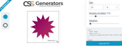
Or, we could simply head over to my online generator to save us the time of drawing it ourselves.
Unfortunately, none of these methods will help us here. In the last article, we learned that the top half of the image needs to overflow the frame in order for the “pop-out” to work. So, we had to get clever and combine mask for the frame’s bottom half and background for its top half.
That means we are unable to rely solely on a clip-path approach. Our solution will rely on mask as we did before, but this time, the mask configuration will be a little more difficult as we will work with a conic-gradient and the mask-composite property to draw the shape. The mask-composite property is probably one you don’t reach for very often, so it will be fun to put it to work on a practical example.
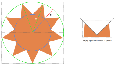
The radius of the big circle, illustrated in green (we’ll call this R);
The radius of the small circle illustrated in blue (this will be R - d).
For the sake of simplicity, I will define d as a percentage of R — R - (R * p) — where p is a number in the range [0 1]. So, in the end, we are left with three variables, N, R, and p.
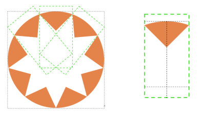
If you look closely at the shape, you can see it is a series of triangular shapes that are cut out of a large circular shape. That is exactly how we are going to tackle this challenge. We can create triangles with conic-gradient and then cut them out of the circle with the mask-composite property. Getting a circle is pretty easy using border-radius: 50%.
The number of conic gradients is equal to the number of triangles in the pattern. Each gradient can use nearly the same configuration, where the difference between them is how they are rotated. That means the gradient’s code will look something like this:
conic-gradient(from -1*angle at {position}, #000 2*angle, #0000 0);
Thankfully, the position we calculated in the last article is similar enough to the point that we can rely on it here as well:
Again, N is the number of triangles, and p controls the radius of the small circle. R is equal to 50%, so the position can also be expressed like this:
We need to resort to some geometry to determine the value of angle. I will skip the boring math for the sake of brevity, but please feel free to leave a comment if you’re interested in the formula, and I will be glad to give you more details.
Now, we need to loop through all of that as many times as there are triangles in the pattern. So, we will do what we did in the last article and switch from vanilla CSS to Sass so we can take advantage of Sass loops.
The following snippet selects the one element in the HTML, <img>, and loops through the conic gradients for as many triangles we set ($n: 9). The output of that loop is saved as another variable, $m, that is applied to the CSS mask.
Again, if the code looks complex, that’s because it is. It can be complex for a number of reasons, from understanding the conic-gradient() syntax to knowing how the mask property behaves to your comfort level working with trigonometry. Then there’s the additional layer of Sass and loops that don’t make things any easier. I’ve said before, but I will do so again: you would be doing yourself a favor to thoroughly read the previous article. The gradient configuration is less complicated in that demonstration, even though it follows the exact same structure.
Great, we have a star-like shape! We’re done. Right? Of course not. We want the inverse of what we currently have: the starburst to be filled with color. That’s where the mask-composite comes into play. We can invert the shape by excluding the triangles we created from the circle to get the starburst shape.
mask:
  linear-gradient(#000 0 0) exclude,
  $m;
We define a linear gradient that will cover the whole area by default, and we exclude it from the other gradients.
The mask property is a shorthand that combines other mask-* properties, one of which is mask-composite. So, when we declare exclude on mask, it’s really like we’re declaring mask-composite: exclude. Otherwise, our code could have looked like this:
All of the conic gradients need to be added together and then excluded from the first layer. That means we would need to use the add keyword as many times as we have gradients. But since add is the default value for mask-composite, adding exclude in the shorthand property is less work.
In theory, mask-composite: exclude could be enough since there is no intersection between the conic gradients. Later, we will move the gradients and create intersections so having an add composition is mandatory for the conic gradients.
I know mask-composite is a convoluted concept. I highly recommend you read Ana Tudor’s crash course on mask composition for a deeper and more thorough explanation of how the mask-composite property works with multiple layers.
With this in place, we have a proper starburst shape to work with:
See the Pen [Startburst shape using CSS Mask](https://codepen.io/t_afif/pen/XWopwRQ) by Temani Afif.
There is nothing new we need to do in order to rotate the shape on hover. In fact, we can re-use the exact same code we wrote in the previous article and combine it with a trick that slows down or speeds up the rotation on hover.
See the Pen [Rotation the shape](https://codepen.io/t_afif/pen/rNojEBN) by Temani Afif.
For the “pop-out” effect, we will follow the same steps we did for the previous article. First, we will update the mask to maintain only the bottom portion of the starburst frame. Remember, the avatar needs to overflow from the top, so we need the bottom half of the starburst to stack in front of the avatar while the top half stacks behind the avatar.
I am adding a linear gradient that covers the top half area of the image, exactly like we did in the previous article. In the following demo, you can see how the bottom half of the starburst is still intact while the top half sits behind the avatar as a semi-circle for the time being.
See the Pen [Removing the top portion of the mask](https://codepen.io/t_afif/pen/qBLrEdY) by Temani Afif.
Let’s tackle the top half of the starburst frame. This is where we will rely on the background property to get back the full starburst shape. We can straight-up copy and paste the same gradient configuration from the mask inside the background property as we did in the previous article, but there is a little issue. The gradient configuration includes the mask-composite value that is supported by mask but not the background property.
We are still going to use the same gradient configuration, but we will play with colors to simulate the same result that we would get with mask-composite if we were able to use it in the background:
I am using a red color value inside the conic gradients. That won’t affect the masking part because the color doesn’t matter in mask. From there, I will add the conic gradients we are using to the background property with a blue coloration behind (the background-color).
See the Pen [Adding the background configuration](https://codepen.io/t_afif/pen/poqevbN) by Temani Afif.
The mask is doing its job on the half bottom of the starburst frame, and we can see the conic gradients in red on the top half of the frame. The avatar is overflowing from the top like we want, but we still need to remove the red color behind it. The solution is to use the same color as the background behind it, whatever that happens to be.
This won’t make our effect fully transparent, but that’s no big deal for this exercise. Let’s consider this a small drawback until I come up with a clever idea on how to use transparency instead. If you have any ideas that might work, please share them with me in the comments, and I’ll check them out.
This is looking pretty good so far, right?
See the Pen [Updating the gradient colors](https://codepen.io/t_afif/pen/gOZmbgV) by Temani Afif.
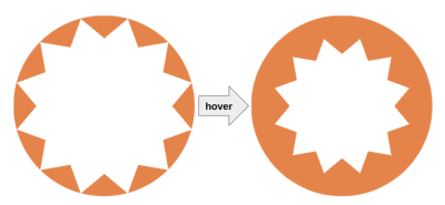
The last step is to write the styles that make the avatar bigger on hover while the starburst frame becomes smaller. To decrease the size of the starburst shape, we will use yet another technique from the previous article: update the position of the conic gradients to make them closer to the center. For this we will introduce an --i variable to the equation of the position.
Initially, --i will be equal to 0; on hover, it will become a positive value, which will make the starburst look smaller. Note that this movement will create an intersection between the conic gradients, as we discussed earlier.
Let’s try another fancy effect where the avatar is hidden, and on hover, it slides from the bottom to “pop out” while, at the same time, we update the starburst shape.
See the Pen [Fancy Pop Out Reveal hover effect!](https://codepen.io/t_afif/pen/VwqWRyj) by Temani Afif.
Cool, right? We are still using only one <img> element in the markup, but this time, I introduced the sliding effect. This will be your homework! I will let you dissect the code to understand what I have changed.
Hint: A CSS Tip where I am using the sliding effect.
Wrapping Up
I hope you enjoy having a little extra practice on the techniques we used in the previous article to create this “pop-out” hover effect. If it feels like I went a little faster this time around, it’s because I did. Rather than spending time explaining the same concepts and techniques, I was more concerned with demonstrating them in a slightly different context. So, we learned a few new ideas for working with gradients in CSS masks and background images!
In spite of the complexity of everything we covered, there is nothing that requires you to understand everything at once or even right away. Take the time to go through this and the previous article step-by-step until you grasp the parts that are toughest for you to grok. In all honesty, you will probably never find yourself in a situation where you need to use all these tricks together. This was a pretty niche exercise. But it provides us with an excuse to individually inspect the techniques that can help you solve some complex problems in CSS without resorting to scripting or extra HTML.
As for the math and the formulas, you don’t need to accurately understand them. The goal is to demonstrate that we can be as accurate as we want when it comes to calculating values and still develop something that is incredibly maintainable with only a few variables. Without trigonometric functions and calc() in CSS, we would be obliged to manually set all of the values once we need to update something, which would be incredibly tedious.
I’ll close this little series with a last demo. Enjoy!
See the Pen [Pop out hover effect featuring Kevin and Alvaro](https://codepen.io/t_afif/pen/zYyWGPY) by Temani Afif.


