Do you have a low-resolution graphic that’s extremely blurry or pixelated, and you want to sharpen it?
Well, there’s a straightforward Photoshop technique for image sharpening that can help you transform a blurry and pixelated image into something sharper.
Step 1.
First, open your image in Photoshop, then navigate to Filter > Blur > Gaussian Blur.
Step 2.
Apply some Gaussian Blur to the image, like this:
Step 3.
Next, go to Image > Adjustments > Levels.
Step 4.
In the Levels dialog box, slide both the left and right markers towards the center.
Step 5.
As you move them, you’ll notice the image gradually becomes sharper.
Do note that this method is most effective with two-tone graphics where there’s a clear color distinction between the object and the background.
Animations are an essential part of a website. They can draw attention, guide users on their journey, provide satisfying and meaningful feedback to interaction, add character and flair to make the website stand out, and so much more!
On top of that, CSS has provided us with transitions and keyframe-based animations since at least 2009. Not only that, the Web Animations API and JavaScript-based animation libraries, such as the popular GSAP, are widely used for building very complex and elaborate animations.
With all these avenues for making things move on the web, you might wonder where the View Transitions API fits in in all this. Consider the following example of a simple task list with three columns.
This is a complex state-based animation, and it is exactly the sort of thing that the View Transitions API is designed to handle. Without it, we would need both the old state (i.e., the outgoing image) and the new state (i.e., the incoming image) to be present in the DOM. This is where complexity kicks in. It can be very difficult to handle and maintain states in the DOM and is not necessarily made much easier with other web APIs and/or a JavaScript animation library.
And if things weren’t daunting enough, keep in mind that JavaScript is the most expensive resource on the web and our transition would depend on whichever JavaScript animation library that we choose, which needs to load and parse before it executes. In other words, a transition like this could be very costly in build, accessibility, maintenance, and performance. You wouldn’t be blamed for questioning whether the cost of having the animation is worth the return.
But what if we could leave the extra baggage of dependencies at the door and rely on vanilla JavaScript and CSS? We could let the optimized browser API do all the heavy lifting while maintaining complete control over how transitions behave between states. That’s the value of the View Transitions API and why we need it. It trivializes the types of popular effects that currently require additional overhead.
It might sound simple, but that’s already a lot of heavy lifting that we don’t have to worry about anymore! All we have to do is take care of DOM updates and animation styles. The API also allows us to tap into those individual states and more and gives us full control over the animation using the CSS animation shorthand properties and its individual constituent properties.
Browser Support And Standards Status
In this article, we’re going to take a deep dive into the View Transitions API and explore its potential by building three fun and exciting real-life examples from scratch.
But before we get there, it’s certainly worth restating that the View Transitions API specification is in Candidate Recommendation Snapshot status. That means the CSS Working Group has published the working draft, the W3C has given it a “wide review,” and it is intended to become a formal W3C Recommendation. Until that happens, the specification will remain a Candidate Recommendation and is in a feedback period (that was scheduled to conclude on December 5, 2023).
So, the View Transitions API is not quite ready for prime time and should be used experimentally at the time of this writing. The latest versions of Chrome, Edge, Opera, and Android Browser currently support the API. Safari has taken a positive position on it, and there’s an open ticket for Firefox adoption. We have to wait for these last two browsers to formally support the API before using it in a production environment.
While we’re on the topic of the View Transition API’s specification and status, I’ll also note that the feature was initially called the “Shared Element Transitions API” before it was known as the View Transitions API. You will still see the old name pop up, particularly articles published in 2021 and 2022 that have not been updated.
Example 1: Crossfade UI State Changes
Let’s start with a relatively simple yet fun example involving a grid of card components. The idea is that clicking on a card’s image expands the image in a sort of lightbox or modal fashion without leaving the current page.
Let’s start with the following markup:
<aside class="overlay">
  <div class="overlay__inner"></div>
</aside>

<main>
  <figure>
    <div>
      <img class="gallery__image" src="image-01.webp" alt="Vast, still lake on a sunny day." />
    </div>
    <figcaption>Peyto Lake, Canada</figcaption>
  </figure>

  <!-- etc. -->
</main>
You can get the full markup, styles, and scripts from the following CodePen. The basic idea is that we have a <main> element that serves as a grid container that contains a series of <figure> elements that are styled as card components.
See the Pen [Image gallery v2 – 1 – starting markup [forked]](https://codepen.io/smashingmag/pen/VwRZoxV) by Adrian Bece.
const overlayWrapper = document.getElementById("js-overlay");
const overlayContent = document.getElementById("js-overlay-target");

function toggleImageView(index) {
  // Get the image element by ID.
  const image = document.getElementById(`js-gallery-image-${index}`);

  // Store image parent element.
  const imageParentElement = image.parentElement;

  // Move image node from grid to modal.
  moveImageToModal(image);

  // Create a click listener on the overlay for the active image element.
  overlayWrapper.onclick = function () {
    // Return the image to its parent element
    moveImageToGrid(imageParentElement);
  };
}

// Helper functions for moving the image around and toggling the overlay.
function moveImageToModal(image) {
  // Show the overlay
  overlayWrapper.classList.add("overlay--active");
  overlayContent.append(image);
}

function moveImageToGrid(imageParentElement) {
  imageParentElement.append(overlayContent.querySelector("img"));
  // Hide the overlay.
  overlayWrapper.classList.remove("overlay--active");
}
On card click, we are moving the image element from the grid markup into the overlay, leaving the container node empty. We are also setting the overlay onclick event — which moves the image back into its origin container — as well as toggling the visibility CSS class on the overlay element.
It’s important to note that we are moving the image element from the <figure> element that is contained in the <main> container into an <aside> element with a .js-overlay class that represents the lightbox’s overlay, or backdrop. So, we have the same DOM node in <main> and the <aside>.
Now that we have finished setting up the markup, basic styles, and JavaScript functionality, we are going to create our first state transition using the View Transitions API! We call document.startViewTransition and pass our callback function that updates the DOM by passing the image from <main> to the <aside>:
// Fallback
if (!document.startViewTransition) {
  doSomething(/*...*/);
  return;
}

// Use View Transitions API
document.startViewTransition(() => doSomething( /*...*/ ));
Let’s look at the toggleImageView function and implement the API. moveImageToModal and moveImageToGrid are the functions that update the DOM. All we have to do is pass them as a callback to the startViewTransition function!
function toggleImageView(index) {
  const image = document.getElementById(`js-gallery-image-${index}`);

  const imageParentElement = image.parentElement;

  if (!document.startViewTransition) {
    // Fallback if View Transitions API is not supported.
    moveImageToModal(image);
  } else {
    // Start transition with the View Transitions API.
    document.startViewTransition(() => moveImageToModal(image));
  }

  // Overlay click event handler setup.
  overlayWrapper.onclick = function () {
    // Fallback if View Transitions API is not supported.
    if (!document.startViewTransition) {
      moveImageToGrid(imageParentElement);
      return;
    }

    // Start transition with the View Transitions API.
    document.startViewTransition(() => moveImageToGrid(imageParentElement));
  };
}
Let’s take a look at our example with the View Transitions API included. Remember, this is only going to work in Chrome at the moment.
See the Pen [Image gallery v2 – 2 – view transitions API [forked]](https://codepen.io/smashingmag/pen/BabBXPa) by Adrian Bece.
We got this neat little cross-fade animation right out of the box just by passing the DOM update functions as a callback to document.startViewTransition!
Naming A Transition Element In CSS
When we call the startViewTransition function, the API takes a screenshot of the old page state and performs the DOM update. When the update is complete, the new, live state is captured. It’s important to point out that what we see during the transition is generated by the CSS and not the actual DOM elements. That’s a smart way of avoiding potential accessibility and usability issues during the transition.
By default, View Transitions API will perform a cross-fade animation between the old (fade-out) and new (fade-in) states.
We’re merely crossfading between the two screen states, and that includes all elements within it (i.e., other images, cards, grid, and so on). The API is unaware that the image that is being moved from the container (old state) to the overlay (new state) is the same element.
We need to instruct the browser to pay special attention to the image element when switching between states. That way, we can create a special transition animation that is applied only to that element. The CSS view-transition-name property applies the name of the view transition we want to apply to the transitioning elements and instructs the browser to keep track of the transitioning element’s size and position while applying the transition.
We get to name the transition anything we want. Let’s go with active-image, which is going to be declared on a .gallery__image--active class that is a modifier of the class applied to images (.gallery-image) when the transition is in an active state:
Note that view-transition-namehas to be a unique identifier and applied to only a single rendered element during the animation. This is why we are applying the property to the active image element (.gallery__image--active). We can remove the class when the image overlay is closed, return the image to its original position, and be ready to apply the view transition to another image without worrying whether the view transition has already been applied to another element on the page.
So, we have an active class, .gallery__image--active, for images that receive the view transition. We need a method for applying that class to an image when the user clicks on that respective image. We can also wait for the animation to finish by storing the transition in a variable and calling await on the finished attribute to toggle off the class and clean up our work.
// Start the transition and save its instance in a variable
const transition = document.startViewTransition(() =>l /* ... */);
// Wait for the transition to finish.
await transition.finished;
/* Cleanup after transition has completed */
Let’s apply this to our example:
function toggleImageView(index) {
  const image = document.getElementById(`js-gallery-image-${index}`);

  // Apply a CSS class that contains the view-transition-name before the animation starts.
  image.classList.add("gallery__image--active");

  const imageParentElement = image.parentElement;

  if (!document.startViewTransition) {
    // Fallback if View Transitions API is not supported.
    moveImageToModal(image);
  } else {
    // Start transition with the View Transitions API.
    document.startViewTransition(() => moveImageToModal(image));
  }

  // This click handler function is now async.
  overlayWrapper.onclick = async function () {
    // Fallback if View Transitions API is not supported.
    if (!document.startViewTransition) {
      moveImageToGrid(imageParentElement);
      return;
    }

    // Start transition with the View Transitions API.
    const transition = document.startViewTransition(() => moveImageToGrid(imageParentElement));

    // Wait for the animation to complete.
    await transition.finished;

    // Remove the class that contains the page-transition-tag after the animation ends.
    image.classList.remove("gallery__image--active");
  };
}
Alternatively, we could have used JavaScript to toggle the CSS view-transition-name property on the element in the inline HMTL. However, I would recommend keeping everything in CSS as you might want to use media queries and feature queries to create fallbacks and manage it all in one place.
// Applies view-transition-name to the image
image.style.viewTransitionName = "active-image";

// Removes view-transition-name from the image
image.style.viewTransitionName = "none";
And that’s pretty much it! Let’s take a look at our example (in Chrome) with the transition element applied.
See the Pen [Image gallery v2 – 3 – transition element [forked]](https://codepen.io/smashingmag/pen/zYbOgmp) by Adrian Bece.
It looks much better, doesn’t it? With a few additional lines of CSS and JavaScript, we managed to create this complex transition between the two states that would otherwise take us hours to create.
What we just looked at is what I would call the default experience for the View Transitions API. We can do so much more than a transition that crossfades between two states. Specifically, just as you might expect from something that resembles a CSS animation, we can configure a view transition’s duration and timing function.
In fact, the View Transitions API makes use of CSS animation properties, and we can use them to fully customize the transition’s behavior. The difference is what we declare them on. Remember, a view transition is not part of the DOM, so what is available for us to select in CSS if it isn’t there?
When we run the startViewTransition function, the API pauses rendering, captures the new state of the page, and constructs a pseudo-element tree:
Each one is helpful for customizing different parts of the transition:
::view-transition: This is the root element, which you can consider the transition’s body element. The difference is that this pseudo-element is contained in an overlay that sits on top of everything else on the top.
::view-transition-group: This mirrors the size and position between the old and new states.
::view-transition-image-pair: This is the only child of ::view-transition-group, providing a container that isolates the blending work between the snapshots of the old and new transition states, which are direct children.
::view-transition-old(...): A snapshot of the “old” transition state.
::view-transition-new(...): A live representation of the new transition state.
Yes, there are quite a few moving parts! But the purpose of it is to give us tons of flexibility as far as selecting specific pieces of the transition.
So, remember when we applied view-transition-name: active-image to the .gallery__image--active class? Behind the scenes, the following pseudo-element tree is generated, and we can use the pseudo-elements to target either the active-image transition element or other elements on the page with the root value.
In our example, we want to modify both the cross-fade (root) and transition element (active-image ) animations. We can use the universal selector (*) with the pseudo-element to change animation properties for all available transition elements and target pseudo-elements for specific animations using the page-transition-tag value.
/* Apply these styles only if API is supported */
@supports (view-transition-name: none) {
  /* Cross-fade animation */
  ::view-transition-image-pair(root) {
    animation-duration: 400ms;
    animation-timing-function: ease-in-out;
  }

  /* Image size and position animation */
  ::view-transition-group(active-image) {
    animation-timing-function: cubic-bezier(0.215, 0.61, 0.355, 1);
  }
}
See the Pen [Image gallery v2 – 4 – custom CSS [forked]](https://codepen.io/smashingmag/pen/jOJNgXM) by Adrian Bece.
We’re already checking for support in the code we’ve written so far:
// etc.

// Move the image from the grid container to the overlay.
if (!document.startViewTransition) {
  // Fallback if View Transitions API is not supported.
  moveImageToModal(image);
} else {
  // Start transition with the View Transitions API.
  document.startViewTransition(() => moveImageToModal(image));
}

// Move the image back to the grid container.
overlayWrapper.onclick = async function () {
  // Fallback if View Transitions API is not supported.
  if (!document.startViewTransition) {
    moveImageToGrid(imageParentElement);
    return;
  }
}

// etc.
Let’s break that down and get a firm grasp on how it works. To start, all we have to do to detect feature support in JavaScript is check if the startViewTransition function exists in the document object:
// Fallback
if (!document.startViewTransition) {
  doSomething(/*...*/);
  return;
}

// Use View Transitions API (Arrow functions).
document.startViewTransition(() => doSomething(/*...*/));
Then, in CSS, we can use the @supports at-rule to conditionally apply styles based on whether the browser supports a certain feature. Typically, we apply styles when the feature is supported. That said, it’s also possible to apply styles when the feature is not supported.
@supports (view-transition-name: none) {
/* View Transitions API is supported */
/* Use the View Transitions API styles */
}
@supports not (view-transition-name: none) {
/* View Transitions API is not supported */
/* Use a simple CSS animation if possible */
}
At the same time, @supports is still a relatively new feature and might not be an ideal approach if you need feature detection in older version browsers that might not support it. In that case, we can conditionally apply the CSS class using JavaScript:
if("startViewTransition" in document) {
  document.documentElement.classList.add("view-transitions-api");
}
Now, we can style the transition in CSS on the condition of a .view-transitions-api added to the <html> element:
/* View Transitions API is supported */
html.view-transitions-api {}

/* View Transitions API is not supported */
html:not(.view-transitions-api) {}
That means we can render something like this if the View Transitions API is unsupported:
Of course, any time we talk about movement on the web, we also ought to be mindful of users with motion sensitivities and ensure that we account for an experience that reduces motion.
That’s what the CSS prefers-reduced-motion query is designed for! With it, we can sniff out users who have enabled accessibility settings at the OS level that reduce motion and then reduce motion on our end of the work. The following example is a heavy-handed solution that nukes all animation in those instances, but it’s worth calling out that reduced motion does not always mean no motion. So, while this code will work, it may not be the best choice for your project, and your mileage may vary.
Here is the completed demo with fallbacks and prefers-reduced-motion snippet implemented. Feel free to play around with easings and timings and further customize the animations.
See the Pen [Image gallery v2 – completed [forked]](https://codepen.io/smashingmag/pen/dyrybPL) by Adrian Bece.
Example 2: Using CSS Keyframes To Transition Elements
That first example was meant to help us understand the basics of the View Transitions API. What we looked at is considered a default transition — one that crossfades between two states. But we can produce more interesting transitions by defining our own CSS @keyframes and making use of animation properties to configure a custom animation.
Let’s create an interactive to-do list with three-column containers. We’ll use a similar approach as before and customize the animation to make the motion more natural. Specifically, the clicked to-do item will subtly scale up as it leaves the parent container, scale back down, and then slightly bounce when it moves to its target container. The remaining to-do list elements should also be animated smoothly to cover the empty space that the completed to-do item leaves behind.
We’ll start with the View Transitions API already implemented with a default crossfade animation. Check out the following CodePen for more details.
This is what we would get if we were to apply the default crossfade transition we made in the last example:
See the Pen [To-do list v2 – 1 – crossfade [forked]](https://codepen.io/smashingmag/pen/RwdwbWb) by Adrian Bece.
The crossfade is nice but not spectacular. It would be better if the transition was more informative as it’s pretty tough to follow the to-do item to its new container; it just sort of teleports from one container to another. The whole point of this example is that we will customize the transition with CSS animations.
We can use the same setup as the last example. The only difference with this example is that we have two possible containers for to-do items to transition to: “Done” and “Won’t Do.” That means we have one column that serves as the “source” container and two columns that serve as “destination” containers.
function moveCard(isDone) {
  const card = this.window.event.target.closest("li");

  // Get the target column id (done or wont do).
  const destination = document.getElementById(
    `js-list-${isDone ? "done" : "not-done"}`
  );

  // We'll use this class to hide the item controls.
  card.classList.add("card-moving");

  if (!document.startViewTransition) {
    destination.appendChild(card);
    return;
  }

  const transition = document.startViewTransition(() => {
    // Update DOM (move the clicked card).
    destination.appendChild(card);
  });
}
Notice how the View Transitions API freezes rendering, and we cannot interact with any other element on the page while the animation is running. This is an important limitation to keep in mind, so it’s best to avoid creating lengthy animations that might harm usability and even impact performance in the form of a slow Interaction to Next Paint (INP) Core Web Vital metric, depending on what is being blocked by the transition.
Creating Transition Elements
Let’s start by adding the CSS view-transition-name property values to the to-do items and setting up a basic animation that updates an item’s position. We’ll use two different sets of view-transition-name values for this example:
card-active: This is a to-do item that is currently being moved to another column. We’ll apply this right before the animation runs and remove it once the animation ends.
card-${index + 1}: This is applied to the leftover to-do items once the completed item has transitioned to its new destination container. Each to-do item gets a unique index number to help sort their order and update positions to fill the empty space left behind by the completed to-do item.
Now, the to-do items no longer crossfade, but the browser does keep track of their positions and sizes and animates them accordingly.
// Assign unique `view-transition-name` values to all task cards.
const allCards = document.querySelectorAll(".col:not(.col-complete) li");
allCards.forEach(
  (c, index) => (c.style.viewTransitionName = `card-${index + 1}`)
);

// This function is now async.
async function moveCard(isDone) {
  const card = this.window.event.target.closest("li");

   // Apply card-active to a card that has been clicked on.
   card.style.viewTransitionName = "card-active";

  const destination = document.getElementById(
    `js-list-${isDone ? "done" : "not-done"}`
  );

  card.classList.add("card-moving");

  if (!document.startViewTransition) {
    destination.appendChild(card);
    return;
  }

  const transition = document.startViewTransition(() => {
    destination.appendChild(card);
  });

  // Wait for the animation to complete.
  await transition.finished;

  // Cleanup after the animation is done.
  card.style.viewTransitionName = "none";
}
And, just like that, we have a really nice animation set up for to-do items. Notice how all we’re really doing in the code is toggling view-transition-name values and telling the browser which elements to watch position and size for. That’s really all we need, and we get a pretty powerful transition out of it!
See the Pen [To-do list v2 – 2 – transition elements [forked]](https://codepen.io/smashingmag/pen/MWxWgKr) by Adrian Bece.
While this animation looks pretty good, it feels somewhat rigid at the same time. What gives? Sometimes, a view transition looks impressive right out of the box, like we saw in the first example using a default crossfade. Other times, though, the animation requires extra fine-tuning.
Applying CSS Keyframes
Let’s fix the rigidity of our current animation by defining our own CSS @keyframes that scale and bounce completed to-do items. We can take full advantage of CSS animation properties and create our custom keyframes to get a more appealing transition between states.
Let’s break down the animation sequence:
The clicked to-do item should scale up — increase in size — like it’s being lifted out of its source container and then “fly” toward the destination container, where it bounces when touching the ground.
Meanwhile, the leftover to-do items located below the newly completed item should wait a moment before moving their positions up in the list to account for the completed item’s leftover space.
The leftover to-do items shift positions. The container should wait before shrinking to its new height so it doesn’t cut off other to-do items.
The containers resize to their new heights instantly without a crossfade transition.
Let’s start with the delayed animation for the leftover to-do items and the container. Again, items in the “To Do” column are assigned unique view-transition-name values (e.g., card-1, card-2, and so on). We are able to select the entire group of them in CSS with the universal selector (*) on the ::view-transition-group pseudo-element rather than writing them out individually, then declare an animation-delay on them:
Next, we’ll do essentially the same thing for the source and destination containers. We want to delay their animations for a brief moment as the completed to-do item completes its transition. Referencing the DOM tree, we noted at the beginning of this article, we know that the ::view-transition-old and :view-transition-new pseudo-elements are available, and they happen to represent the source and destination containers, respectively.
We’ll target those states at the transition’s root level:
/* Delay container shrinking (shrink after cards have moved) */
::view-transition-old(root),
::view-transition-new(root) {
  animation-delay: 0.2s;
  animation-duration: 0s; /* Skip the cross-fade animation, resize instantly */
}
Let’s customize the animation that is triggered when a to-do item is clicked. First, we’ll adjust the clicked item’s animation-duration by selecting it with the ::view-transition-group pseudo-element scoped to the active item, which we had earlier named card-active:
The previous two examples demonstrate view transitions that run a single animation on a single element. Let’s increase the complexity and see just how powerful the View Transitions API can be. In this third example, we’ll create two animations that run one in sequence. Specifically, we’re going to apply a view transition on a common interaction on e-commerce sites: the user adding an item to the cart.
First, the click event will activate a dot that moves to the cart icon in the page header. Then, the displayed number of items in the cart will animate to its updated value.
As in the previous examples, we’ll start with a basic setup for the default crossfade transition. This time, we’re working with a grid of product cards that each contain a button that, when clicked, reveals a “dot” in the same shape as the button that transitions from the product card to a shopping cart. That shopping cart is an icon located in the top-right corner of the page and includes a counter that increments when items are added (or removed) from the cart.
First, we need to toggle a view-transition-transition value for the dot and cart elements in their respective transition animations. We’re using await transition.finished to delay the counter increment animation until the dot has finished its journey to the cart. We are registering two new view transition names in the process, cart-dot and cart-counter:
Now, we have what we need to jump back into CSS and customize both animations. Let’s define two @keyframes animations; one called toDown and another fromUp that pretty much do what it says on the tin:
/* Counter fade out and moving down */
@keyframes toDown {
  from {
    transform: translateY(0);
    opacity: 1;
  }
  to {
    transform: translateY(4px);
    opacity: 0;
  }
}

/* Counter fade in and coming from top */
@keyframes fromUp {
  from {
    transform: translateY(-3px);
    opacity: 0;
  }
  to {
    transform: translateY(0);
    opacity: 1;
  }
}
For the dot animation, we’ll change its animation-duration and animation-timing-function, and for the counter, we’ll add a slight vertical movement to a standard crossfade animation.
A couple of things worth noting in this setup. First, we’re wrapping the animation rulesets in @supports to ensure they are only applied if the user’s browser supports the View Transitions API. If the browser does not support the basic view-transition-name property, then we can safely assume there’s no support for view transitions at all.
Next, notice that there are no animations on the counter-dot element, nor are there CSS properties applied to it that would change its dimensions. That’s because the dot’s dimensions respond to its parent container. In other words, the dot’s initial position is in the product cart’s button container before it moves to the smaller shopping cart container.
Our temporary dot element responds to container dimensions and the API detects this change in dimensions and positions and provides a smooth transition out of the box. (Large preview)
This is a perfect example of how the View Transitions API tracks an element’s position and dimensions during animation and transitions between the old and new snapshots right out of the box!
See the Pen [Add to cart animation v2 – completed [forked]](https://codepen.io/smashingmag/pen/dyrybpB) by Adrian Bece.
That all being said, we still need to be careful how we use and implement animations. For starters, we’re still talking about a feature that is supported only in Chrome at the time of this writing. But with Safari’s positive stance on it and an open ticket to implement it in Firefox, there’s plenty of hope that we’ll get broader support — we just don’t know when.
Also, the View Transitions API may be “easy,” but it does not save us from ourselves. Think of things like slow or repetitive animations, needlessly complex animations, serving animations to those who prefer reduced motion, among other poor practices. Adhering to animation best practices has never been more important. The goal is to ensure that we’re using view transitions in ways that add delight and are inclusive rather than slapping them everywhere for the sake of showing off.
In another article to follow this one, we’ll use View Transitions API to create full-page transitions in our single-page and multi-page applications — you know, the sort of transitions we see when navigating between two views in a native mobile app. Now, we have those readily available for the web, too!
Until then, go build something awesome… and use it to experiment with the View Transitions API!
Browsers shipped a new set of CSS viewport units in 2022. These units make it easier to size elements in mobile browsers, where the browser’s retractable UI affects the height of the viewport as the user scrolls the page. Unfortunately, the new units do not make it easier to size elements in desktop browsers, where classic scrollbars affect the width and height of the viewport.
The following video shows a desktop browser with classic scrollbars. As we resize the viewport (dashed line) in different ways, the CSS length 100dvw matches the width of the viewport in all situations except when a vertical classic scrollbar is present on the page. In that case, 100dvw is larger than the viewport width. This is the classic scrollbar problem of CSS viewport units. When the page has a vertical classic scrollbar, the length 100dvw is larger than the viewport width. In fact, all viewport units have this problem.
When the page has a vertical classic scrollbar, the length 100dvw is larger than the viewport width. All viewport units have this problem.
Before discussing the solutions and workarounds to the classic scrollbar problem, we should familiarize ourselves with all the relevant concepts, which include the visual and layout viewport, the two types of zoom, the initial containing block, the original and new viewport units, and the two types of scrollbars.
The Visual And Layout Viewports
The viewport is the rectangular section of the web browser in which the web page is rendered. For example, when a web page loads in Safari on an iPhone SE, the viewport has a width of 375 CSS pixels1 and a height of 548 CSS pixels. This size is called the “small viewport size”. If the user then scrolls the page, causing the browser’s UI to retract, the height of the viewport increases to 626 CSS pixels, an additional 78 pixels. This size is called the “large viewport size”.
1 The width and height of the viewport are measured in CSS pixels, not device pixels. On most modern displays, especially on mobile devices, one CSS pixel consists of two or more device pixels.
If the user rotates their device and the operating system switches to landscape mode, the size of the viewport changes (it becomes wider than it is tall), but there is again a small and large viewport size.
The small and large viewport sizes on an iPhone in portrait and landscape modes. (Large preview)
In desktop browsers, the size of the viewport can change as well (e.g., when the user resizes the browser window, opens the browser’s sidebar, or zooms the page), but there is no separate “small viewport size” and “large viewport size” like in mobile browsers.
So far, I’ve only talked about the “viewport,” but there are, in fact, two different viewports in web browsers: the visual viewport and the layout viewport. When the page initially loads in the browser, the visual viewport and the layout viewport have the exact same size and position. The two viewports diverge in the following two cases:
When the user zooms in on a part of the page via a pinch-to-zoom or double-tap gesture, the part of the page that is visible on the screen is the visual viewport. The size of the visual viewport (in CSS pixels) decreases because it shows a smaller part of the page. The size of the layout viewport has not changed.
When the browser’s virtual keyboard appears on mobile platforms, the smaller part of the page that is visible on the screen above the keyboard is once again the visual viewport. The height of the visual viewport decreases with the height of the virtual keyboard. The size of the layout viewport has again not changed.
It’s worth noting that as part of shipping the new viewport units in 2022, Chrome stopped resizing the layout viewport and initial containing block (ICB) when the virtual keyboard is shown. This behavior is considered the “the best default”, and it ensures that the new viewport units are consistent across browsers. This change also made the mobile web feel less janky because resizing the ICB is a costly operation. However, the virtual keyboard may still resize the layout viewport in some mobile browsers.
In these two cases, the visual viewport continues to be “the rectangular section of the web browser in which the web page is rendered,” while the layout viewport becomes a larger rectangle that is only partially visible on the screen and that completely encloses the visual viewport. In all other situations, both viewports have the same size and position.
One benefit of the two-viewport system is that when the user pinch-zooms and pans around the page, fixed-positioned elements don’t stick to the screen, which would almost always be a bad experience. That being said, there are valid use cases for positioning an element above the virtual keyboard (e.g., a floating action button). The CSS Working Group is currently discussing how to make this possible in CSS.
CSS viewport units are based on the layout viewport, and they are unaffected by changes to the size of the visual viewport. Therefore, I will focus on the layout viewport in this article. For more information about the visual viewport, see the widely supported Visual Viewport API.
“There are two kinds of zoom: page zoom, which affects the size of the initial viewport, and the visual viewport scale factor, which acts like a magnifying glass and does not affect the initial viewport or actual viewport.”
Page zoom is available in desktop browsers, where it can be found in the browser’s menu under the names “Zoom in” and “Zoom out” or just “Zoom”. When the page is “zoomed in,” the size of the layout viewport shrinks, which causes the page to reflow. If the page uses CSS media queries to adapt to different viewport widths (i.e., responsive web design), those media query breakpoints will be triggered by page zoom.
Scale-factor zoom is available on all platforms. It is most commonly performed with a pinch-to-zoom gesture on the device’s touch screen (e.g., smartphone, tablet) or touchpad (e.g., laptop). As I mentioned in the previous section, the size of the layout viewport does not change when zooming into a part of the page, so the page does not reflow.
Page Zoom
Visual Viewport Scale Factor
Available on
Desktop platforms
All platforms
Activated by
Keyboard command, menu option
Pinch-to-zoom or double-tap gesture
Resizes
Both layout and visual viewport
Only visual viewport
Does it cause reflow?
Yes
No
The Layout Viewport And The Initial Containing Block
The layout viewport is the “containing block” for fixed-positioned elements. In other words, fixed-positioned elements are positioned and sized relative to the layout viewport. For this reason, the layout viewport can be viewed as the “position fixed viewport,” which may even be a better name for it.
/* this element completely covers the layout viewport */
.elem {
  position: fixed;
  top: 0;
  bottom: 0;
  left: 0;
  right: 0;
}
Here’s a tip for you: Instead of top: 0, bottom: 0, left: 0, and right: 0 in the snippet above, we can write inset: 0. The inset property is a shorthand property for the top, bottom, left, and right properties, and it has been supported in all major browsers since April 2021.
The initial containing block(ICB) is a rectangle that is positioned at the top of the web page. The ICB has a static size, which is the “small viewport size.” When a web page initially loads in the browser, the layout viewport and the ICB have the exact same size and position. The two rectangles diverge only when the user scrolls the page: The ICB scrolls out of view, while the layout viewport remains in view and, in the case of mobile browsers, grows to the “large viewport size.”
The ICB is the default containing block for absolutely positioned elements. In other words, absolutely positioned elements are, by default, positioned and sized relative to the ICB. Since the ICB is positioned at the top of the page and scrolls out of view, so do absolutely-positioned elements.
/* this element completely covers the ICB by default */
.elem {
  position: absolute;
  top: 0;
  left: 0;
  right: 0;
  bottom: 0;
}
The ICB is also the containing block for the <html> element itself, which is the root element of the web page. Since the ICB and the layout viewport initially have the same size (the “small viewport size”), authors can make the <body> element as tall as the initial viewport by setting height to 100% on both the <html> and <body> element.
Some websites, such as Google Search, use this method to position the page footer at the bottom of the initial viewport. Setting height to 100% is necessary because, by default, the <html> and <body> elements are only as tall as the content on the page.
Layout Viewport
Initial Containing Block
Containing block for
position: fixed elements
position: absolute elements
Is it visible?
Always in view (at least partially2).
Scrolls out of view (positioned at the top of the page).
Size
Small or large viewport size (depending on the browser UI)
Small viewport size
2The layout viewport is not fully visible when the user zooms in on the part of the page and when the browser’s virtual keyboard is shown.
The New Viewport Units
The CSS viewport units are specified in the CSS Values and Units Module, which is currently at Level 4. The original six viewport units shipped in browsers a decade ago. The new units shipped in major browsers over the past year, starting with Safari 15.4 in May 2022 and ending with Samsung Internet 21 in May 2023.
Note: The new viewport units may not be correctly implemented in some mobile browsers.
Layout Viewport
Original Units (2013)
New Unit Equivalent (2022)
Width
vw
svw, lvw, dvw
Height
vh
svh, lvh, dvh
Inline Size
vi
svi, lvi, dvi
Block Size
vb
svb, lvb, dvb
Smaller Size
vmin
svmin, lvmin, dvmin
Larger Size
vmax
svmax, lvmax, dvmax
A few clarifications:
The “inline size” and “block size” are either the width or the height, depending on the writing direction. For example, in writing systems with a left-to-right writing direction, the inline size is the width (vi is equivalent to vw), and the block size is the height (vb is equivalent to vh).
The ”smaller size” and “larger size” are either the width or the height, depending on which one is larger. For example, if the viewport is rather tall than it is wide (e.g., a smartphone in portrait mode), then the smaller size is the width (vmin is equivalent to vw), and the larger size is the height (vmax is equivalent to vh).
Each viewport unit is equal to one-hundredth of the corresponding viewport size. For example, 1vw is equal to one-hundredth of the viewport width, and 100vw is equal to the entire viewport width.
For each of the six original units, there are three new variants with the prefixes s, l, and d (small, large, and dynamic, respectively). This increases the total number of viewport units from 6 to 24.
The s-prefixed units represent the “small viewport size.”
This means that 100svh is the height of the initial layout viewport when the browser’s UI is expanded.
The l-prefixed units represent the “large viewport size.”
This means that 100lvh is the height of the layout viewport after the browser’s UI retracts. The height difference between the large and small viewport sizes is equivalent to the collapsible part of the browser’s UI:
100lvh - 100svh = how much the browser’s UI retracts
The old unprefixed units (i.e., vw, vh, and so on) are equivalent to the l-prefixed units in all browsers, which means that they also represent the “large viewport size.” For example, 100vh is equivalent to 100lvh.
The d-prefixed units represent the current size of the layout viewport, which can be either the “small viewport size” or the “large viewport size.” This means that 100dvh is the actual height of the layout viewport at any given point in time. This length changes whenever the browser’s UI retracts and expands.
Why Do We Have New CSS Units?
In previous years, the Android version of Chrome would resize the vh unit whenever the browser’s UI retracted and expanded as the user scrolled the page. In other words, vh behaved like dvh. But then, in February 2017, Chrome turned vh into a static length that is based on the “largest possible viewport”. In other words, vh started behaving like lvh. This change was made in part to match Safari’s behavior on iOS, which Apple implemented as a compromise:
“Dynamically updating the [100vh] height was not working. We had a few choices: drop viewport units on iOS, match the document size like before iOS 8, use the small view size, or use the large view size.
From the data we had, using the larger view size was the best compromise. Most websites using viewport units were looking great most of the time.”
With this change in place, the same problem that occurred in iOS Safari also started happening in Chrome. Namely, an element with height: 100vh, which is now the “large viewport size,” is taller than the initial viewport, which has the “small viewport size.” That means the bottom part of the element is not visible in the viewport when the web page initially loads. This prompted discussions about creating a solution that would allow authors to size elements based on the small viewport size. One of the suggestions was an environment variable, but the CSS Working Group ultimately decided to introduce a new set of viewport units.
/* make the hero section as tall as the initial viewport */
.hero {
  height: 100svh;
}
The same height can be achieved by setting height to 100% on the .hero element and all its ancestors, including the <body> and <html> elements, but the svh unit gives authors more flexibility.
I wasn’t able to find any good use cases for the dvh unit. It seems to me that sizing elements with dvh is not a good idea because it would cause constant layout shifts as the user scrolled the page. I had considered dvh for the following cases:
For fixed-positioned elements, such as modal dialogs and sidebars, height: 100% behaves the same as height: 100dvh because the containing block for fixed-positioned elements is the layout viewport, which already has a height of 100dvh. In other words, height: 100% works because 100% of 100dvh is 100dvh. This means that the dvh unit is not necessary to make fixed-positioned elements full-height in the dynamic viewport of mobile browsers.
For vertical scroll snapping, setting the individual “pages” to height: 100dvh results in a glitchy experience in mobile browsers. That being said, it is entirely possible that mobile browsers could fix this issue and make scroll snapping with height: 100dvh a smooth experience.
There is no concept of a “small viewport size” and a “large viewport size” in desktop browsers. All viewport units, new and old, represent the current size of the layout viewport, which means that all width units are equivalent to each other (i.e., vw= svw = lvw = dvw), and all height units are equivalent to each other (i.e., vh = svh = lvh = dvh). For example, if you replaced 100vh with 100svh in your code, nothing would change in desktop browsers.
This behavior isn’t exclusive to desktop platforms. It also occurs on mobile platforms in some cases, such as when a web page is embedded in an <iframe> element and when an installed web app opens in standalone mode.
A test page for viewport units in different contexts where the small and large viewport sizes are equivalent. From left to right: iframe, standalone mode, 3D touch preview on iOS. (Large preview)
It is possible for the small and large viewport sizes to be equivalent even during regular web browsing in mobile browsers. I have found two such cases:
In Safari on iOS, if the user chooses the “Hide Toolbar” option from the page settings menu, the browser’s UI will retract and stay retracted while the user scrolls the page and navigates to other web pages.
In Firefox on Android, if the user disables the “Scroll to hide toolbar” option in Settings → Customize, the browser’s UI will completely stop retracting when the user scrolls web pages.
The Two Types Of Scrollbars
In a web browser, scrollbars can be either classic or overlay. On mobile platforms, scrollbars are exclusively overlay. On desktop platforms, the user can choose the scrollbar type in the operating system’s settings. The classic scrollbar option is usually labeled “Always show scrollbars.” On Windows, scrollbars are classic by default. On macOS, scrollbars are overlay by default (since 2011), but they automatically switch to classic if the user connects a mouse.
The main difference between these two types of scrollbars is that classic scrollbars are placed in a separate ”scrollbar gutter” that consumes space when present, which reduces the size of the layout viewport; meanwhile, overlay scrollbars, as the name suggests, are laid over the web page without affecting the size of the layout viewport.
When a (vertical) classic scrollbar appears on the page in a desktop browser with classic scrollbars, the width of the layout viewport shrinks by the size of the scrollbar gutter, which is usually 15 to 17 CSS pixels. This causes the page to reflow. The size and position of absolutely and fixed-positioned elements may also change. By default, the browser only shows a classic scrollbar when the page overflows, but the page can force the scrollbar (or empty scrollbar track) to be shown and hidden via the CSS overflow property.
To prevent the page from reflowing whenever a vertical classic scrollbar is shown or hidden, authors can set scrollbar-gutter: stable on the <html> element. This declaration tells the browser to always reserve space for the classic scrollbar. The declaration has no effect in browsers with overlay scrollbars. The scrollbar-gutter property is not supported in Safari at the time of writing this article.
A benefit of classic scrollbars is that they make it clear when an element on the page has a scrollable overflow. In comparison, overlay scrollbars are not shown unless the user actually attempts to scroll an element that is a scroll container with overflow. This can be a problem because the user may not even notice that an element contains more content than initially visible. Chrome for Android mitigates this problem by showing the overlay scrollbar until the user scrolls the element at least once.
The overlay scrollbar in macOS is barely visible on some websites. (Large preview)
Even if the Windows operating system switches to overlay scrollbars by default in the future, some users prefer classic scrollbars and will turn them on if possible. Therefore, developers should test in browsers with classic scrollbars and ensure that their websites remain usable.
Issues Related To Classic Scrollbars
When testing your website in a desktop browser with classic scrollbars, the two main issues to look out for are unexpected extra scrollbars caused by small amounts of overflow and empty scrollbar tracks that serve no real purpose. These are usually not major issues, but they make the website appear not quite right, which may confuse or even annoy some visitors.
Some classic scrollbar issues, such as the depicted double scrollbar, only manifest after disabling JavaScript in the browser. (Large preview)
Issue 1: Setting overflow To scroll Instead Of auto
Whether or not a scroll container has overflow depends on the content length, viewport width, and other factors. In situations when there is no overflow, it’s usually better to hide the scrollbar than to show an empty scrollbar track in browsers with classic scrollbars. Such an automatic scrollbar behavior can be enabled by setting overflow to auto on the scroll container.
When a website is developed on macOS, which uses overlay scrollbars by default, the developer may mistakenly set overflow to scroll instead of auto. Overlay scrollbars behave in the same manner whether overflow is set to auto or scroll. The scrollbar only appears when the user attempts to scroll an element that is a scroll container with overflow. Classic scrollbars behave differently. Notably, if overflow is set to scroll but the element does not overflow, then the browser will show empty scrollbar tracks. To avoid this problem, set overflow to auto instead of scroll.
Auto scrollbars trade the problem of empty scrollbar tracks with the problem of content reflow, but the latter problem can be avoided by setting scrollbar-gutter to stable on the scroll container, as I previously mentioned.
The three empty scrollbar tracks on Apple Feedback Assistant add visual noise to the design. (Large preview)
Issue 2: Assuming That The Full Width Of A Media Query Is Available
CSS media queries don’t take into account the fact that classic scrollbars reduce the width of the viewport. In other words, media queries assume scrollbars never exist. For example, if the width of the layout viewport is 983 pixels, and the page has a vertical classic scrollbar that is 17 pixels wide, the media query (min-width: 1000px) is true because it “pretends” that the scrollbar isn’t there. And indeed, if we were to hide the scrollbar, the viewport width would grow to 1,000 pixels (983 + 17 = 1000).
@media (min-width: 1000px) {
/*
  This does *not* mean that the viewport is
  ”at least 1000px wide”.

  The viewport width could be as low as 983px
  under normal circumstances.
*/
}
This behavior is by design. Media queries “assume scrollbars never exist” in order to prevent infinite loops. Web developers should not assume that the entire width of a media query is available on the web page. For example, avoid setting the width of the page to 1000px inside a @media (min-width: 1000px) rule.3
3 Apple does not seem to agree with this reasoning. In Safari, media queries take scrollbars into account, which means that the appearance and disappearance of a classic scrollbar can trigger media query breakpoints, although the browser seems to guard against infinite loops. Nonetheless, Safari’s behavior is considered a bug.
Issue 3: Using 100vw to make an element full width
The length 100vw is equivalent to the width of the layout viewport, except in one case. If the page has a vertical classic scrollbar, 100vw is larger than the viewport width. Due to this anomaly, setting an element to width: 100vw causes the page to overflow horizontally by a small amount in browsers with classic scrollbars.
MIT Technology Review mistakenly sets the width of the header to 100vw, which causes the page to overflow horizontally. (Large preview)
“Issue: Level 3 assumes scrollbars never existed because it was hard to implement, and only Firefox bothered to do so. This is making authors unhappy. Can we improve here?”
The note is referring to Firefox’s past behavior, where the browser would reduce the size of 100vw on pages that set overflow to scroll on the <html> element. Such pages had a stable scrollbar track, and in that case, 100vw matched the actual viewport width. This behavior was removed from Firefox in 2017, and it was dropped from the CSS specification shortly after. In a recent change of heart, the CSS Working Group decided to revert their earlier decision and reinstate the behavior:
“RESOLVED: If overflow: scroll is set on the root element (not propagated from <body>), account for the default scrollbar width in the size of vw. Also, take scrollbar-gutter […] into account on the root.”
At the time of writing this article, this change has not yet made it into the CSS specification. It will take some time until all the major browsers ship the new behavior.
Solving The Classic Scrollbar Problem
As the title of this article states, the new viewport units did not solve the classic scrollbar problem. The new svw, dvw, and lvw units are equivalent to the original vw unit in browsers (i.e., 100svw = 100dvw = 100lvw = 100vw). At first glance, this may seem like a missed opportunity to solve the classic scrollbar problem with the new viewport units. For example, the length 100dvw could have represented the actual viewport width as it dynamically changes in response to the appearance and disappearance of a vertical classic scrollbar. This would have allowed developers to make any element on the page as wide as the viewport more easily.
There are at least two reasons why the new viewport units did not solve the classic scrollbar problem:
The new viewport units were introduced to solve the problem of 100vh being taller than the initial viewport in mobile browsers. A small mobile viewport due to the browser’s expanded UI is different from a small desktop viewport due to the presence of classic scrollbars on the page, so the same s-prefixed viewport units cannot represent the small viewport in both cases. If they did, then, for example, using 100svh to solve a layout issue in mobile browsers would have potentially unwanted side effects in desktop browsers and vice-versa.
The CSS Working Group recently decided to mitigate the classic scrollbar problem by making 100vw smaller in browsers with classic scrollbars when the scrollbar-gutter property is set to stable on the <html> element. The idea is that when the page has a stable scrollbar gutter, the space for the scrollbar is reserved in advance, so the appearance of the scrollbar does not decrease the viewport width. In other words, the viewport has a static width that isn’t affected by the scrollbar. In that case, the length 100vw can safely match the viewport width at all times, whether the scrollbar is present or not. Once this behavior makes it into browsers, developers will be able to use scrollbar-gutter: stable to prevent width: 100vw from horizontally overflowing the page.
/* THIS BEHAVIOR HAS NOT YET SHIPPED IN BROWSERS */

/* On pages with a stable scrollbar gutter */
html {
  scrollbar-gutter: stable;
}

/* 100vw can be safely used */
.full-width {
  width: 100vw;
}
Avoiding The Classic Scrollbar Problem
Since at least 2018, developers have been using CSS custom properties that are dynamically updated via JavaScript to get the actual size of the viewport in CSS. In the following example, the custom property --vw is a dynamic version of the vw unit that is correctly updated when the viewport width changes due to the appearance or disappearance of a vertical classic scrollbar. The CSS variable falls back to 1vw when JavaScript fails to execute or doesn’t load at all.
In the JavaScript code, document.documentElement.clientWidth returns the width of the ICB, which is also the width of the layout viewport. Since the global resize event does not fire when a classic scrollbar changes the viewport width, I’m instead using a resize observer on the <html> element.
new ResizeObserver(() => {
  let vw = document.documentElement.clientWidth / 100;
  document.documentElement.style.setProperty('--vw', `${vw}px`);
}).observe(document.documentElement);
With the introduction of CSS container queries to browsers over the past year, another solution that doesn’t require JavaScript became available. By turning the <body> element into an inline-size query container, the length 100cqw — which is the width of <body> in this case — can be used instead of 100vw to get the desired result. Unlike 100vw, 100cqw becomes smaller when a vertical classic scrollbar appears on the page.
body {
  margin: 0;
  container-type: inline-size;
}

.full-width {
  width: 100vw; /* fallback for older browsers */
  width: 100cqw;
}
Container queries have been supported in all desktop browsers since February 2023. If the page has additional nested query containers, the <body> element’s width (100cqw) can be stored in a registered custom property to make it available inside those query containers. Registered custom properties are not supported in Firefox at the time of writing this article.
Conclusion
If you’d like to learn more about the concepts discussed in this article, I recommend the viewport investigation project, which was a collaboration between browser vendors to “research and improve the state of interoperability of existing viewport measurement features.” The new viewport units were, in fact, one of the focus areas of Interop 2022.
You know what’s perhaps the “cheapest” way to make a slider of images, right? You set up a container, drop a bunch of inline image elements in it, then set overflow-x: auto on it, allowing us to swipe through them. The same idea applies nicely to a group of cards, too.
See the Pen [Cheap Slider [forked]](https://codepen.io/smashingmag/pen/eYxoXpv) by Geoff Graham.
While that’s a quick and dirty way to get a slider up and running, there is more we can do to smooth it out a bit. That’s what we’re going to cover in this tutorial. Specifically, we’re improving our cheap slider with controlled scrolling, courtesy of CSS Scroll Snapping. The idea is that the slider naturally stops on an image during the scroll. Otherwise, we could blow through a bunch of images in a single swipe and lose our place.
But we’ll go deeper than scroll snapping. The thing with sliders is that it can be difficult to instruct them on where to “snap.” For example, what if we want to configure the slider in such a way that images always snap at the left (or inline-start) edge when swiping right to left?
But that’s not even the “tricky” part we’re looking at. Say we are working within an existing page layout where the main container of the page has a set amount of padding applied to it. In this case, the slider should always begin at the inline starting edge of the inside of the container, and when scrolling, each image should snap to the edge rather than scroll past it.
Simply drop the slider in the layout container, right? It’s not as straightforward as you might think. If you notice in the illustrations, the slider is outside the page’s main container because we need it to go full-width. We do that in order to allow the images to scroll fully edge-to-edge and overflow the main body.
Our challenge is to make sure the slider snaps into place consistent with the page layout’s spacing, indicated by the dashed blue lines in the drawings. The green area represents the page container’s padding, and we want images to snap right at the blue line.
The Basic Layout
Let’s start with some baseline HTML that includes a header and footer, each with an inner .container element that’s used for the page’s layout. Our slider will sit in between the header and footer but lack the same inner .container that applies padding and width to it so that the images scroll the full width of the page.
<header>
  <div class="container">
    <!-- some contained header with some nav items -->
  </div>
</header>
<main>
  <section class="slider">
    <!-- our slider -->
  </section>
  <section class="body-text">
    <div class="container">
      <!-- some contained text -->
    </div>
  </section>
</main>
<footer>
  <div class="container">
    <!-- a contained footer -->
  </div>
</footer>
Creating The Container
In contrast to the emphasis I’ve put on scroll snapping for this demo, the real power in creating the slider does not actually start with scroll snapping. The trick to create something like this starts with the layout .container elements inside the header and footer. We’ll set up a few CSS variables and configure the .container’s properties, such as its width and padding.
The following bit of CSS defines a set of variables that are used to control the maximum width and padding of a container element. The @media rules are used to apply different values to these properties depending on the viewport’s width.
The first couple of lines of the :root element’s ruleset define two CSS custom properties: --c-max-width and --c-padding. These properties are used to control the layout .container’s maximum width and padding.
Next up, we have our @media rules. These apply different values to the –-c-max-width and --c-padding properties depending on the screen size. For example, the first @media rule updates the value of --c-max-width from 100% to 800px, as well as the --c-padding from 10px to 12px when the screen width is at least 768px.
Those are the variables. We then set up the style rules for the container, which we’ve creatively named .container, and apply those variables to it. The .container’s maximum width and inline padding are assigned to the also creatively-named -c-max-width and --c-padding variables. This opens up our container’s variables at a root level so that they can easily be accessed by other elements when we need them.
I am using pixels in these examples because I want this tutorial to be about the actual technique instead of using different sizing units. Also, please note that I will be using CSS nesting for the demos, as it is supported in every major browser at the time I’m writing this.
The Scroll-Snapping
Let’s work on the scroll-snapping part of this slider. The first thing we’re going to do is update the HTML with the images. Remember that this slider is outside of the .container (we’ll take care of that later).
Now we have a a group of divs that are direct children of the .slider. And those, in turn, each contain one image element. With this intact, it’s time for us to style this as an actual slider. Flexbox is an efficient way to change the display behavior of the .slider’s divs so that they flow in the inline direction rather than stacking vertically as they naturally would as block-level elements. Using Flexbox also gives us access to the gap property to space things out a bit.
.slider {
  display: flex;
  gap: 24px;
}
Now we can let the images overflow the .slider in the horizontal, or inline, direction:
Before we apply scroll snapping, we ought to configure the divs so that the images are equally sized. A slider is so much better to use when the images are visually consistent rather than having a mix of portrait and landscape orientations, creating a jagged flow. We can use the flex property on the child divs, which is shorthand for the flex-shrink, flex-grow, and flex-basis properties:
This way, the divs are only as big as the content they contain and will not exceed a width of 300px. But! In order to contain the images in the space, we will set them to take up the full 100% width of the divs, slap an aspect-ratio on them to maintain proportions, then use the object-fit property to to cover the div’s dimensions.
We’re using the scroll-snap-type property on the .slider container to initialize scroll snapping in the horizizontal (x) direction. The mandatory keyword means we’re forcing the slider to snap on items in the container instead of allowing it to scroll at will and land wherever it wants.
We’re using the scroll-snap-align property on the divs to set the snapping on the item’s start-ing edge (or “right” edge in a typical horizontal left-to-right writing mode).
Good so far? Here’s what we’ve made up to this point:
See the Pen [Cheap Slider, Scroll Snapped [forked]](https://codepen.io/smashingmag/pen/MWLRxXE) by Geoff Graham.
Now that we have all of our pieces in place, it’s time to create the exact snapping layout we want. We already know what the maximum width of the page’s layout .container is because we set it up to change at different breakpoints with the variables we registered at the beginning. In other words, the .container’s width will never exceed the value of --c-max-width. We also know the container always has a padding equal to the value of --c-padding.
Again, our slider is outside of the .container, and yet, we want the scroll-snapped images to align with those values for a balanced page layout. Let’s create a new CSS variable, but this time scoped to the .slider and set it up to calculate the space between the viewport and the inside of the .container element.
That is a lot of math! First, we’re calculating the minimum value of either the .container element’s max-width or 100%, whichever is smaller, then increasing this minimum value with padding on the .slider. This result is then subtracted from 100%. From this, we get the total amount of space that is available to offset either side of the .slider to align with the layout .container.
We then divide this number by 2 to get the offset width for each specific side. And finally, we add the .container’s inline padding to the offset width so that the .slider is offset from the inside edges of the container rather than the outside edges. In the demo, I have used the universal selector (*) and its pseudos to measure the box-sizing of all elements by the border-box so that we are working inside the .slider’s borders rather than outside of it.
If you think that our code is becoming a bit too chaotic, we can certainly improve it a bit. When I run into these situations, I sometimes like to organize things into multiple custom properties just for easy reading. For example, we could combine the inline paddings that are scoped to the :root and update the slider’s --offset-width variable with a calc() function that’s a bit easier on the eyes.
We have a fully-functioning scroll scroll-snapping container at this point! The last thing for us to do is apply padding to it that aligns with the layout .container. As a reminder, the challenge is for us to respect the page layout’s padding even though the .slider is a full-width element outside of that container.
This means we need to apply our newly-created --offset-width variable to the .slider. We’ve already scoped the variable to the .slider, so all we really need is to apply it to the right properties. Here’s what that looks like:
The padding-inline and scroll-padding-inline-start properties are used to offset the slider from the left and right sides of its container and to ensure that the slider is always fully visible when the user scrolls.
padding-inline
This sets spacing inside the .slider’s inline edges. A nice thing about using this logical property instead of a physical property is that we can apply the padding in both directions in one fell swoop, as there is no physical property shorthand that combines padding-left and padding-right. This way, the .slider’s internal inline spacing matches that of the .container in a single declaration.
scroll-padding-inline-start
This sets the scroll padding at the start of the slider’s inline dimension. This scroll padding is equal to the amount of space that is added to the left (i.e., inline start) side of the .slider’s content during the scroll.
Now that the padding-inline and scroll-padding-inline-start properties are both set to the value of the --offset-width variable, we can ensure that the slider is perfectly aligned with the start of our container and snaps with the start of that container when the user scrolls.
We could take all of this a step further by setting the gap of our slider items to be the same as our padding gap. We’re really creating a flexible system here:
Personally, I would scope this into a new custom property of the slider itself, but it’s more of a personal preference. The full demo can be found on CodePen. I added a toggle in the demo so you can easily track the maximum width and paddings while resizing.
See the Pen [Full width scroll snap that snaps to the container [forked]](https://codepen.io/smashingmag/pen/xxMeBJa) by utilitybend.
But we don’t have to stop here! We can do all sorts of calculations with our custom properties. Maybe instead of adding a fixed width to the .slider’s flex children, we want to always display three images at a time inside of the container:
That --flex-width custom property takes 100% of the container the slider is in and subtracts it by two times the --gap. And, because we want three items in view at a time, we divide that result by 3.
See the Pen [Updated scroll container with 3 items fitted in container [forked]](https://codepen.io/smashingmag/pen/WNPWmgo) by utilitybend.
The best thing about using custom properties to handle calculations is that they are lighter and more performant than attempting to handle them in JavaScript. It takes some getting used to, but I believe that we should use these kinds of calculations a lot more often. Performance is such an important feature. Even seemingly minor optimizations like this can add up and really make a difference to the overall end-user experience.
And, as we’ve seen, we can plug in variables from other elements into the equation and use them to conform an element to the properties of another element. That’s exactly what we did to conform the .slider’s inner padding to the padding of a .container that is completely independent of the slider. That’s the power of CSS variables — reusability and modularity that can improve how elements interact within and outside other elements.
Whether you’re looking to master a cutting-edge Photoshop feature or hone your design skills, Photoshop tutorials serve as your ultimate guide. Continuous skill enhancement is crucial for any seasoned graphic designer.
In this all-encompassing guide, we’ve curated a collection of top-notch Photoshop tutorials designed to help you craft surreal visuals, enhance portrait photography, and transform your images into extraordinary works of art. Let’s dive into the list!
This tutorial walks you through 75 detailed steps to craft an imaginative “Flying Car Illustration” using Photoshop. Starting with a simple selection exercise on a vintage car image, the guide integrates flying rocks, towers, wires, and birds to form a lively scene. It also employs free 3D renders and fractal packs to infuse abstract elements into the artwork. This tutorial is both fun and educational, suitable for Photoshop users of all levels.
Learn how to set your text ablaze using Adobe Photoshop’s Flame Filter in this comprehensive tutorial. The guide starts by helping you set up an appropriate background and then moves on to color and shading adjustments. Following that, you’ll delve into the Flame Filter settings to generate realistic fire effects that wrap around your text. The tutorial concludes with additional tips on enhancing the glow and sparks for a more vibrant outcome.
This tutorial provides a straightforward technique to effortlessly remove unwanted elements from an image’s background. It guides you through the use of Photoshop’s Object Selection Tool and the Content-Aware Fill feature. The process is quick and only involves a few steps, making it perfect for graphic designers who need to tidy up their images for different projects.
This tutorial, called “Stuck in the Wall,” is a fun and creative project designed for kids and parents. The goal is to create an optical illusion that makes it appear as if someone is taped to a wall. To achieve this, you’ll need to take photos from specific angles.
Once you have your photos, the tutorial guides you through various Photoshop techniques. These include layer masking, quick selection, and refining edges. You’ll also learn how to add realistic shadows and other finishing touches to make the illusion truly convincing.
This tutorial takes you step-by-step through the process of creating realistic water droplets on a window-like surface. You’ll start by gathering the necessary resources and installing custom water drop brushes in Adobe Photoshop.
After setting up, you’ll move on to adding basic water drops and creating a background effect. The final part of the tutorial focuses on adding reflections to the water droplets, making them look even more convincing.
This tutorial teaches you a non-destructive method for sharpening your images in Photoshop. Although the content is brief, it promises to guide you through enhancing the sharpness of your images in just a few easy steps.
This tutorial guides you through creating an abstract geometric photo collage art piece. You’ll start by using Adobe Illustrator to build geometric lines. Then, you’ll switch to Photoshop to cut and rearrange pieces of a photograph.
The tutorial also includes steps for adding textures and making curves adjustments. These additional elements give your design a retro style, making it a unique piece of art.
This comprehensive tutorial guides you through the process of creating a stencil banner text effect in Adobe Photoshop. You’ll learn how to use various tools and techniques, including shape properties, smart objects, textures, and layer styles.
Additionally, the tutorial teaches you how to use the Warp command to give your text a three-dimensional appearance. From setting up the background to adding final touches like shadows and gradients, this tutorial covers it all.
This tutorial focuses on teaching you how to create impactful lighting effects using Adobe Photoshop and the Flame Painter plugin. The course is designed to enhance advertising campaigns or promotional material by emphasizing the importance of lighting in design.
This tutorial guides you through the steps to create a trendy double exposure effect from scratch. You’ll start by understanding the basics of what double exposure is and then move on to preparing the main photo and combining two images.
The tutorial also offers tips on using blending modes and clipping masks to make the image more surrealistic, along with adding the finishing touches.
This comprehensive tutorial guides you through the process of creating an isometric pixel art coffee shop. You’ll start by working out the dimensions of the building and then move on to adding finer details like awnings, shop signs, and outdoor furniture.
The tutorial also provides tips on color shading and texture, aiming to help you create a vintage-style coffee shop. It’s designed to be part of a series that could eventually help you build an entire pixel art city.
This tutorial takes you through the steps to create a retro Star Wars-inspired text effect. You’ll learn how to use layer styles, space textures, and flare brush tips to achieve a vintage sci-fi font effect.
The tutorial also goes into detail on adjusting gradient effects and combining different textures. Plus, you’ll learn how to add outer glows and flares for a more dynamic look.
This advanced tutorial teaches you how to create an abstract medical image featuring a DNA strand. It covers a wide range of techniques, from blending modes and adjustment layers to custom brushes for special effects.
You’ll learn how to transform a 3D DNA model into a realistic-looking strand and add various effects to make it appear as if it’s under a microscope. The tutorial also includes steps for creating a textured background and adding depth of field for a more dynamic image.
This tutorial by Sheridan Johns guides you through creating an Iron Man fan art piece. Although initially published in 2012, the techniques remain relevant today.
The tutorial covers everything from initial sketching to adding finishing effects like smoke and sparks. You’ll learn digital painting techniques, layering, shading, and texturing to create a realistic metallic look for Iron Man.
This tutorial guides you through creating a text portrait, known as a Calligram. You’ll learn how to use Photoshop’s Displace filter to overlay and deform text on a portrait.
The resulting image is made up of tiny words that shape the facial features, appearing as a pattern from afar but revealing the text upon closer inspection.
This tutorial teaches you how to create a realistic 3D chrome badge using Photoshop’s 3D tools and Adobe Illustrator. You’ll start by designing a flat badge in Illustrator, focusing on shape construction and text alignment.
Then, you’ll import the design into Photoshop to convert it into a 3D model. The tutorial covers setting up lighting and materials to achieve a chrome finish, as well as fine-tuning the 3D settings for depth and reflections.
This comprehensive tutorial aims to help you create your own floral fashion print for fabric. It covers everything from sketching motifs and considering scale to adding colors and creating a flowing pattern repeat.
You’ll learn how to draw clean lines, layer colors, and arrange motifs in a way that looks natural and dynamic. The tutorial also offers tips on preparing your design for fabric printing.
This family-friendly tutorial explores the concept of being insect-sized and guides you through creating a digital photo where a child appears to be miniaturized in a natural setting.
The tutorial is interactive, with specific instructions for both parents and children. It’s divided into several parts, including capturing the right photos, setting up the Photoshop files, and adding final touches, making it a fun and educational experience for the whole family.
This tutorial guides you through the process of creating an animated neon sign using Adobe Illustrator and Photoshop. You’ll start by designing the layout of the neon sign in Illustrator, focusing on creating non-overlapping vector paths for the neon tubes.
Then, you’ll export the design to Photoshop to apply layer styles that give the neon tubes a glowing effect. The tutorial also covers how to animate the neon sign using Photoshop’s Timeline panel, resulting in an animated GIF that simulates a real neon sign.
This tutorial teaches you how to create a high-contrast, noir-style image inspired by the Sin City films. Starting with a stock photo, you’ll learn various Photoshop techniques to transform it into a striking, high-contrast image.
This tutorial teaches you how to create a text effect that mimics the look of bright autumn leaves. You’ll learn a range of techniques, including using leaf images, textures, adjustment layers, and lighting effects.
The tutorial guides you through creating a textured background, adding text as a reference, and layering leaves over the text. It also delves into adding more depth and realism through texture and lighting adjustments.


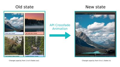
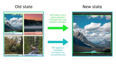
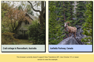
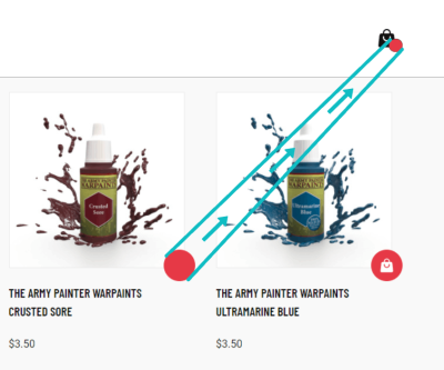

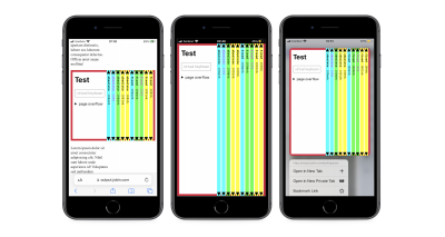
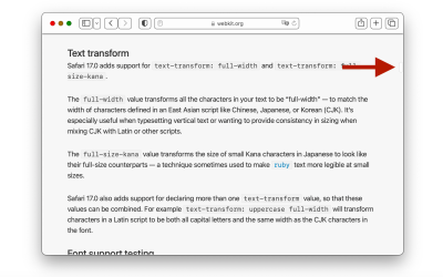
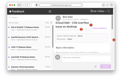
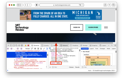
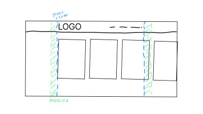
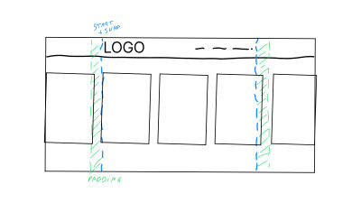


