Setting And Persisting Color Scheme Preferences With CSS And A “Touch” Of JavaScript

Setting And Persisting Color Scheme Preferences With CSS And A “Touch” Of JavaScript

Setting And Persisting Color Scheme Preferences With CSS And A “Touch” Of JavaScript

Henry Bley-Vroman

2024-03-25T12:00:00+00:00
2024-03-26T22:07:24+00:00

Many modern websites give users the power to set a site-specific color scheme preference. A basic implementation is straightforward with JavaScript: listen for when a user changes a checkbox or clicks a button, toggle a class (or attribute) on the <body> element in response, and write the styles for that class to override design with a different color scheme.

CSS’s new :has() pseudo-class, supported by major browsers since December 2023, opens many doors for front-end developers. I’m especially excited about leveraging it to modify UI in response to user interaction without JavaScript. Where previously we have used JavaScript to toggle classes or attributes (or to set styles directly), we can now pair :has() selectors with HTML’s native interactive elements.

Supporting a color scheme preference, like “Dark Mode,” is a great use case. We can use a <select> element anywhere that toggles color schemes based on the selected <option> — no JavaScript needed, save for a sprinkle to save the user’s choice, which we’ll get to further in.

Respecting System Preferences

First, we’ll support a user’s system-wide color scheme preferences by adopting a “Light Mode”-first approach. In other words, we start with a light color scheme by default and swap it out for a dark color scheme for users who prefer it.

The prefers-color-scheme media feature detects the user’s system preference. Wrap “dark” styles in a prefers-color-scheme: dark media query.

selector {
  /* light styles */

  @media (prefers-color-scheme: dark) {
    /* dark styles */
  }
}

Next, set the color-scheme property to match the preferred color scheme. Setting color-scheme: dark switches the browser into its built-in dark mode, which includes a black default background, white default text, “dark” styles for scrollbars, and other elements that are difficult to target with CSS, and more. I’m using CSS variables to hint that the value is dynamic — and because I like the browser developer tools experience — but plain color-scheme: light and color-scheme: dark would work fine.

:root {
  /* light styles here */
  color-scheme: var(--color-scheme, light);
  
  /* system preference is "dark" */
  @media (prefers-color-scheme: dark) {
    --color-scheme: dark;
    /* any additional dark styles here */
  }
}

Giving Users Control

Now, to support overriding the system preference, let users choose between light (default) and dark color schemes at the page level.

HTML has native elements for handling user interactions. Using one of those controls, rather than, say, a <div> nest, improves the chances that assistive tech users will have a good experience. I’ll use a <select> menu with options for “system,” “light,” and “dark.” A group of <input type="radio"> would work, too, if you wanted the options right on the surface instead of a dropdown menu.

<select id="color-scheme">
  <option value="system" selected>System</option>
  <option value="light">Light</option>
  <option value="dark">Dark</option>
</select>

Before CSS gained :has(), responding to the user’s selected <option> required JavaScript, for example, setting an event listener on the <select> to toggle a class or attribute on <html> or <body>.

But now that we have :has(), we can now do this with CSS alone! You’ll save spending any of your performance budget on a dark mode script, plus the control will work even for users who have disabled JavaScript. And any “no-JS” folks on the project will be satisfied.

What we need is a selector that applies to the page when it :has() a select menu with a particular [value]:checked. Let’s translate that into CSS:

:root:has(select option[value="dark"]:checked)

We’re defaulting to a light color scheme, so it’s enough to account for two possible dark color scheme scenarios:

  1. The page-level color preference is “system,” and the system-level preference is “dark.”
  2. The page-level color preference is “dark”.

The first one is a page-preference-aware iteration of our prefers-color-scheme: dark case. A “dark” system-level preference is no longer enough to warrant dark styles; we need a “dark” system-level preference and a “follow the system-level preference” at the page-level preference. We’ll wrap the prefers-color-scheme media query dark scheme styles with the :has() selector we just wrote:

:root {
  /* light styles here */
  color-scheme: var(--color-scheme, light);
    
  /* page preference is "system", and system preference is "dark" */
  @media (prefers-color-scheme: dark) {
    &:has(#color-scheme option[value="system"]:checked) {
      --color-scheme: dark;
      /* any additional dark styles, again */
    }
  }
}

Notice that I’m using CSS Nesting in that last snippet. Baseline 2023 has it pegged as “Newly available across major browsers” which means support is good, but at the time of writing, support on Android browsers not included in Baseline’s core browser set is limited. You can get the same result without nesting.

:root {
  /* light styles */
  color-scheme: var(--color-scheme, light);
    
  /* page preference is "dark" */
  &:has(#color-scheme option[value="dark"]:checked) {
    --color-scheme: dark;
    /* any additional dark styles */
  }
}

For the second dark mode scenario, we’ll use nearly the exact same :has() selector as we did for the first scenario, this time checking whether the “dark” option — rather than the “system” option — is selected:

:root {
  /* light styles */
  color-scheme: var(--color-scheme, light);
    
  /* page preference is "dark" */
  &:has(#color-scheme option[value="dark"]:checked) {
    --color-scheme: dark;
    /* any additional dark styles */
  }
    
  /* page preference is "system", and system preference is "dark" */
  @media (prefers-color-scheme: dark) {
    &:has(#color-scheme option[value="system"]:checked) {
      --color-scheme: dark;
      /* any additional dark styles, again */
    }
  }
}

Now the page’s styles respond to both changes in users’ system settings and user interaction with the page’s color preference UI — all with CSS!

But the colors change instantly. Let’s smooth the transition.

Respecting Motion Preferences

Instantaneous style changes can feel inelegant in some cases, and this is one of them. So, let’s apply a CSS transition on the :root to “ease” the switch between color schemes. (Transition styles at the :root will cascade down to the rest of the page, which may necessitate adding transition: none or other transition overrides.)

Note that the CSS color-scheme property does not support transitions.

:root {
  transition-duration: 200ms;
  transition-property: /* properties changed by your light/dark styles */;
}

Not all users will consider the addition of a transition a welcome improvement. Querying the prefers-reduced-motion media feature allows us to account for a user’s motion preferences. If the value is set to reduce, then we remove the transition-duration to eliminate unwanted motion.

:root {
  transition-duration: 200ms;
  transition-property: /* properties changed by your light/dark styles */;
    
  @media screen and (prefers-reduced-motion: reduce) {
    transition-duration: none;
  }
}

Transitions can also produce poor user experiences on devices that render changes slowly, for example, ones with e-ink screens. We can extend our “no motion condition” media query to account for that with the update media feature. If its value is slow, then we remove the transition-duration.

:root {
  transition-duration: 200ms;
  transition-property: /* properties changed by your light/dark styles */;
    
  @media screen and (prefers-reduced-motion: reduce), (update: slow) {
    transition-duration: 0s;
  }
}

Let’s try out what we have so far in the following demo. Notice that, to work around color-scheme’s lack of transition support, I’ve explicitly styled the properties that should transition during theme changes.

See the Pen [CSS-only theme switcher (requires :has()) [forked]](https://codepen.io/smashingmag/pen/YzMVQja) by Henry.

See the Pen CSS-only theme switcher (requires :has()) [forked] by Henry.

Not bad! But what happens if the user refreshes the pages or navigates to another page? The reload effectively wipes out the user’s form selection, forcing the user to re-make the selection. That may be acceptable in some contexts, but it’s likely to go against user expectations. Let’s bring in JavaScript for a touch of progressive enhancement in the form of…

Persistence

Here’s a vanilla JavaScript implementation. It’s a naive starting point — the functions and variables aren’t encapsulated but are instead properties on window. You’ll want to adapt this in a way that fits your site’s conventions, framework, library, and so on.

When the user changes the color scheme from the <select> menu, we’ll store the selected <option> value in a new localStorage item called "preferredColorScheme". On subsequent page loads, we’ll check localStorage for the "preferredColorScheme" item. If it exists, and if its value corresponds to one of the form control options, we restore the user’s preference by programmatically updating the menu selection.

/*
 * If a color scheme preference was previously stored,
 * select the corresponding option in the color scheme preference UI
 * unless it is already selected.
 */
function restoreColorSchemePreference() {
  const colorScheme = localStorage.getItem(colorSchemeStorageItemName);

  if (!colorScheme) {
    // There is no stored preference to restore
    return;
  }

  const option = colorSchemeSelectorEl.querySelector(`[value=${colorScheme}]`);  

  if (!option) {
    // The stored preference has no corresponding option in the UI.
    localStorage.removeItem(colorSchemeStorageItemName);
    return;
  }

  if (option.selected) {  
    // The stored preference's corresponding menu option is already selected
    return;
  }

  option.selected = true;
}

/*
 * Store an event target's value in localStorage under colorSchemeStorageItemName
 */
function storeColorSchemePreference({ target }) {
  const colorScheme = target.querySelector(":checked").value;
  localStorage.setItem(colorSchemeStorageItemName, colorScheme);
}

// The name under which the user's color scheme preference will be stored.
const colorSchemeStorageItemName = "preferredColorScheme";

// The color scheme preference front-end UI.
const colorSchemeSelectorEl = document.querySelector("#color-scheme");

if (colorSchemeSelectorEl) {
  restoreColorSchemePreference();

  // When the user changes their color scheme preference via the UI,
  // store the new preference.
  colorSchemeSelectorEl.addEventListener("input", storeColorSchemePreference);
}

Let’s try that out. Open this demo (perhaps in a new window), use the menu to change the color scheme, and then refresh the page to see your preference persist:

See the Pen [CSS-only theme switcher (requires :has()) with JS persistence [forked]](https://codepen.io/smashingmag/pen/GRLmEXX) by Henry.

See the Pen CSS-only theme switcher (requires :has()) with JS persistence [forked] by Henry.

If your system color scheme preference is “light” and you set the demo’s color scheme to “dark,” you may get the light mode styles for a moment immediately after reloading the page before the dark mode styles kick in. That’s because CodePen loads its own JavaScript before the demo’s scripts. That is out of my control, but you can take care to improve this persistence on your projects.

Persistence Performance Considerations

Where things can get tricky is restoring the user’s preference immediately after the page loads. If the color scheme preference in localStorage is different from the user’s system-level color scheme preference, it’s possible the user will see the system preference color scheme before the page-level preference is restored. (Users who have selected the “System” option will never get that flash; neither will those whose system settings match their selected option in the form control.)

If your implementation is showing a “flash of inaccurate color theme”, where is the problem happening? Generally speaking, the earlier the scripts appear on the page, the lower the risk. The “best option” for you will depend on your specific stack, of course.

What About Browsers That Don’t Support :has()?

All major browsers support :has() today Lean into modern platforms if you can. But if you do need to consider legacy browsers, like Internet Explorer, there are two directions you can go: either hide or remove the color scheme picker for those browsers or make heavier use of JavaScript.

If you consider color scheme support itself a progressive enhancement, you can entirely hide the selection UI in browsers that don’t support :has():

@supports not selector(:has(body)) {
  @media (prefers-color-scheme: dark) {
    :root {
      /* dark styles here */
    }
  }

  #color-scheme {
    display: none;
  }
}

Otherwise, you’ll need to rely on a JavaScript solution not only for persistence but for the core functionality. Go back to that traditional event listener toggling a class or attribute.

The CSS-Tricks “Complete Guide to Dark Mode” details several alternative approaches that you might consider as well when working on the legacy side of things.

Smashing Editorial
(gg, yk)

Modern CSS Tooltips And Speech Bubbles (Part 2)

Modern CSS Tooltips And Speech Bubbles (Part 2)

Modern CSS Tooltips And Speech Bubbles (Part 2)

Temani Afif

2024-03-08T12:00:00+00:00
2024-03-12T22:08:07+00:00

I hope you were able to spend time getting familiar with the techniques we used to create tooltips in Part 1 of this quick two-parter. Together, we were able to create a flexible tooltip pattern that supports different directions, positioning, and coloration without adding any complexity whatsoever to the HTML.

We leveraged the CSS border-image property based on another article I wrote while applying clever clip-path tricks to control the tooltip’s tail. If you haven’t checked out that article or the first part of this series, please do because we’re jumping straight into things today, and the context will be helpful.

So far, we’ve looked at tooltip shapes with triangular tails with the option to have rounded corners and gradient coloration. Sure, we were able to do lots of things but there are many other — and more interesting — shapes we can accomplish. That’s what we’re doing in this article. We will handle cases where a tooltip may have a border and different tail shapes, still with the least amount of markup and most amount of flexibility.

Before we start, I want to remind you that I’ve created a big collection of 100 tooltip shapes. I said in Part 1 that we would accomplish all of them in these two articles. We covered about half of them in Part 1, so let’s wrap things up here in Part 2.

The HTML

Same as before!

<div class="tooltip">Your text content goes here</div>

That’s the beauty of what we’re making: We can create many, many different tooltips out of the same single HTML element without changing a thing.

Tooltips With Borders

Adding a border to the tooltips we made in Part 1 is tricky. We need the border to wrap around both the main element and the tail in a continuous fashion so that the combined shape is seamless. Let’s start with the first simple shape we created in Part 1 using only two CSS properties:

.tooltip {
  /* tail dimensions */
  --b: 2em; /* base */
  --h: 1em; /* height*/
    
  /* tail position */
  --p: 50%;
    
  border-image: fill 0 // var(--h)
    conic-gradient(#CC333F 0 0);
  clip-path: 
    polygon(0 100%, 0 0,100% 0, 100% 100%,
      min(100%, var(--p) + var(--b) / 2) 100%,
      var(--p) calc(100% + var(--h)),
      max(0%, var(--p) - var(--b) / 2) 100%);
}

Here’s the demo. You can use the range slider to see how flexible it is to change the tail position by updating the --p variable.

See the Pen [Fixing the overflow issue](https://codepen.io/smashingmag/pen/mdoLRVr) by Temani Afif.

See the Pen Fixing the overflow issue by Temani Afif.

The border property is not an option here as far as adding borders to our tooltip. It won’t work. Instead, we need to use a pseudo-element that effectively traces the shape of the main element, then makes it smaller.

Let’s start with the following code:

.tooltip {
  /* tail dimensions */
  --b: 2em; /* base */
  --h: 1em; /* height*/
      
  /* tail position  */
  --p: 50%;
    
  border-image: fill 0 // var(--h)
    conic-gradient(#5e412f 0 0); /* the border color */
  clip-path: 
    polygon(0 100%, 0 0, 100% 0, 100% 100%,
      min(100%, var(--p) + var(--b) / 2) 100%,
      var(--p) calc(100% + var(--h)),
      max(0%, var(--p) - var(--b) / 2) 100%);
  position: relative;
  z-index: 0;
}
.tooltip:before {
  content: "";
  position: absolute;
  inset: 8px; /* border thickness */
  border-image: fill 0 // var(--h)
    conic-gradient(#CC333F 0 0); /* background color  */
  clip-path: inherit;
}

The pseudo-element uses the same border-image and clip-path property values as the main element. The inset property decreases its size from there.

See the Pen [Adding border to the tooltip](https://codepen.io/smashingmag/pen/yLwjqQw) by Temani Afif.

See the Pen Adding border to the tooltip by Temani Afif.

I’d say this looks great at first glance. But things get funky once we start adjusting the tail position. This is because the two clip-path shapes are not aligned since the pseudo-element is covering a smaller area than the main element. We need to keep the left and right values equal to 0 in order to fix this:

inset: 8px 0; 

And let’s adjust the border-image to decrease the size of the colored area from the sides:

border-image: fill 0 / 0 8px / var(--h) 0
  conic-gradient(#CC333F 0 0); /* background color  */

Yes, it’s the border-image trickery from before! So, If you haven’t already, please read my article about border-image to see how we arrived here.

Now things are looking very good:

See the Pen [Fixing the clip-path alignment](https://codepen.io/smashingmag/pen/mdoLGEx) by Temani Afif.

See the Pen Fixing the clip-path alignment by Temani Afif.

The two clip-path shapes are nicely aligned. The tooltip is almost perfect. I say “almost” because there is a small issue with the border’s thickness. The thickness around the tail shape is a little smaller than the one around the element. If you play with the tail dimensions, you’ll see the inconsistency.

Close-up of the tooltip tail border highlighting the difference between the border’s thickness between the main element and the tail.

(Large preview)

This probably is not that a big deal in most cases. A few pixels aren’t a glaring visual issue, but you can decide whether or not it meets your needs. Me? I’m a perfectionist, so let’s try to fix this minor detail even if the code will get a little more complex.

We need to do some math that requires trigonometric functions. Specifically, we need to change some of the variables because we cannot get what we want with the current setup. Instead of using the base variable for the tail’s dimensions, I will consider an angle. The second variable that controls the height will remain unchanged.

Showing two illustrations, one indicating the tail’s base & height and the other indicating the tail’s angle &  height.

(Large preview)

The relationship between the base (--b) and the angle (--a) is equal to B = 2*H*tan(A/2). We can use this to update our existing code:

.tooltip {
  /* tail dimensions */
  --a: 90deg; /* angle */
  --h: 1em; /* height */
    
  --p: 50%; /* position */
  --t: 5px; /* border thickness */
    
  border-image: fill 0 // var(--h)
    conic-gradient(#5e412f 0 0); /* the border color */
  clip-path: 
    polygon(0 100%, 0 0, 100% 0, 100% 100%,
      min(100%, var(--p) + var(--h) * tan(var(--a) / 2)) 100%,
      var(--p) calc(100% + var(--h)),
      max(0%, var(--p) - var(--h) * tan(var(--a) / 2)) 100%);
  position: relative;
  z-index: 0;
}
.tooltip:before {
  content: "";
  position: absolute;
  inset: var(--t) 0;
  border-image: fill 0 / 0 var(--t) / var(--h) 0
    conic-gradient(#CC333F 0 0); /* the background color */
  clip-path: inherit;
}

Nothing drastic has changed. We introduced a new variable to control the border thickness (--t) and updated the clip-path property with the new variables that define the tail’s dimensions.

Now, all the work will be done on the pseudo-element’s clip-path property. It will no longer inherit the main element’s value, but it does need a new value to get the correct border thickness around the tail. I want to avoid getting deep into the complex math behind all of this, so here is the implementation:

clip-path: 
  polygon(0 100%, 0 0, 100% 0, 100% 100%,
    min(100% - var(--t), var(--p) + var(--h)*tan(var(--a)/2) - var(--t)*tan(45deg - var(--a) / 4)) 100%,
    var(--p) calc(100% + var(--h) + var(--t)*(1 - 1/sin(var(--a)/2))),
    max(var(--t), var(--p) - var(--h)*tan(var(--a)/2) + var(--t)*tan(45deg - var(--a)/4)) 100%);

It looks complex because it is! You don’t really need to understand the formulas since all you have to do is adjust a few variables to control everything.

Now, finally, our tooltip is perfect. Here is an interactive demo where you can adjust the position and the thickness. Don’t forget to also play with the dimension of the tail as well.

See the Pen [Tooltip with border and solid color](https://codepen.io/smashingmag/pen/zYbjeop) by Temani Afif.

See the Pen Tooltip with border and solid color by Temani Afif.

Gradients And Rounded Corners

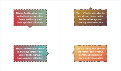
We learned in Part 1 that working with gradients using this approach is pretty great because we’re already supplying a gradient on the border-image property. All we need to do is fill the main element and tail with a real gradient instead of a solid color.

Showing four tooltip variations with different gradient files and striped borders.

(Large preview)

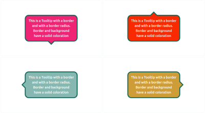
Let’s move on to the rounded corners. We can simply use the code we created in the previous article. We duplicate the shape using a pseudo-element and make a few adjustments for perfect alignment and a correct border thickness.

Showing four tooltip variations with border and rounded corners

(Large preview)

The reason I’m not going into details for this one is to make the point that you don’t have to remember all the various use cases and code snippets by heart. The goal is to understand the actual concepts we are using to build the tooltips, like working with border-image, clip-path(), gradients, and math functions.

I can’t even remember most of the code I write after it’s done, but it’s no issue since all I have to do is copy and paste then adjust a few variables to get the shape I want. That’s the benefit of leveraging modern CSS features — they handle a lot of the work for us.

Border-Only Tooltips

I’d like to do one more exercise with you, this time making a tooltip with no fill but still with a full border around the entire shape. So far, we’ve been able to reuse a lot of the code we put together in Part 1, but we’re going to need new tricks to pull this one off.

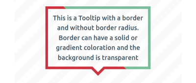
The goal is to establish a transparent background while maintaining the border. We’ll start without rounded corners for the moment.

Tooltip with a thick, solid border around the shape using a gradient with a hard stop between red and mint green.

(Large preview)

See how we’re going to be working with gradients again? I could have used a single color to produce a solid, single-color border, but I put a hard stop in there to demonstrate the idea. We’ll be able to create even more variations, thanks to this little detail, like using multiple colors, different color stops, and even different types of gradients.

You’ll see that the code looks fairly straightforward:

.tooltip {
  /* tail dimension */
  --a: 90deg; /* angle */
  --h: 1em; /* height */
    
  --p: 50%; /* tail position */
  --b: 7px; /* border thickness */
    
  position: relative;
}
.tooltip:before {
  content: "";
  position: absolute;
  inset: 0 0 calc(-1*var(--h));
  clip-path: polygon( ... ); /* etc. */
  background: linear-gradient(45deg, #cc333f 50%, #79bd9a 0); /* colors */
}

We’re using pseudo element again, this time with a clip-path to establish the shape. From there, we set a linear-gradient() on the background.

I said the code “looks” very straightforward. Structurally, yes. But I purposely put a placeholder clip-path value because that’s the complicated part. We needed to use a 16-point polygon and math formulas, which honestly gave me big headaches.

That’s why I turn to my online generator in most cases. After all, what’s the point of everyone spending hours trying to suss out which formulas to use if math isn’t your thing? May as well use the tools that are available to you! But note how much better it feels to use those tools when you understand the concepts that are working under the hood.

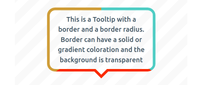
OK, let’s tackle rounded corners:

Tooltip with a transparent background and a three-color border with rounded corners.

(Large preview)

For this one, we are going to rely on not one, but two pseudo-elements, :before and :after. One will create the rounded shape, and the other will serve as the tail.

Illustrating a three-step process showing (1) the full shape with a conic background, (2) an empty rectangle with a gradient border, and (3) the same shape with an empty space for the tail.

(Large preview)

The above figure illustrates the process for creating the rounded part with the :before pseudo-element. We first start with a simple rectangular shape that’s filled with a conic gradient containing three colors. Then, we mask the shape so that the inner area is transparent. After that, we use a clip-path to cut out a small part of the bottom edge to reserve space for the tail we’ll make with the :after pseudo-element.

/* the main element */
.tooltip {
  /* tail dimension */
  --a: 90deg; /* angle */
  --h: 1em; /* height */
    
  --p: 50%; /* tail position  */
  --b: 7px; /* border thickness */
  --r: 1.2em; /* the radius */
    
  position: relative;
  z-index: 0;
}
    
/* both pseudo-elements */
.tooltip:before,
.tooltip:after {
  content: "";
  background: conic-gradient(#4ECDC4 33%, #FA2A00 0 66%, #cf9d38 0);  /* the coloration */
  inset: 0;
  position: absolute;
  z-index: -1;
}
    
/* the rounded rectangle */
.tooltip:before {
  background-size: 100% calc(100% + var(--h));
  clip-path: polygon( ... );
  mask: linear-gradient(#000 0 0) content-box, linear-gradient(#000 0 0);
  mask-composite: exclude;
  padding: var(--b);
}
    
/* the tail */
.tooltip:after {
  content: "";
  position: absolute;
  bottom: calc(-1 * var(--h));
  clip-path: polygon( ... );
}

Once again, the structure is not all that complex and the clip-path value is the tough part. As I said earlier, there’s really no need to get deep into an explanation on it when we can use the points from an online generator to get the exact shape we want.

The new piece that is introduced in this code is the mask property. It uses the same technique we covered in yet another Smashing article I wrote. Please read that for the full context of how mask and mask-composite work together to trim the transparent area. That’s the first part of your homework after finishing this article.

Fun Tail Shapes

We’ve covered pretty much every single one of the tooltips available in my collection. The only ones we have not specifically touched use a variety of different shapes for the tooltip’s tail.

All of the tooltips we created in this series used a simple triangle-shaped tail, which is a standard tooltip pattern. Sure, we learned how to change its dimensions and position, but what if we want a different sort of tooltip? Maybe we want something fancier or something that looks more like a speech or thought bubble.

Three tooltips with (1) a fancy tail, (2) a curved tail, and (3) a trail of bubbles.

(Large preview)

If the rounded corners in the last section are the first part of your homework, then the next part is to try making these tail variations yourself using what we have learned together in these two articles. You can always find the code over at my collection for reference and hints. And, leave a comment here if you have any additional questions — I’m happy to help!

Conclusion

I hope you enjoyed this little series because I sure had a blast writing it. I mean, look at all of the things we accomplished in a relatively short amount of space: simple rectangular tooltips, rounded corners, different tail positions, solid and gradient backgrounds, a bunch of border options, and finally, custom shapes for the tail.

I probably went too far with how many types of tooltips we could make — there are 100 in total when you count them up! But it goes to show just how many possibilities there are, even when we’re always using the same single element in the HTML.

And, it’s great practice to consider all of the different use cases and situations you may run into when you need a tooltip component. Keep these in your back pocket for when you need them, and use my collection as a reference, for inspiration, or as a starting point for your own work!

Further Reading On SmashingMag

Smashing Editorial
(gg, yk)

Modern CSS Tooltips And Speech Bubbles (Part 1)

Modern CSS Tooltips And Speech Bubbles (Part 1)

Modern CSS Tooltips And Speech Bubbles (Part 1)

Temani Afif

2024-03-01T12:00:00+00:00
2024-03-05T22:05:34+00:00

In a previous article, we explored ribbon shapes and different ways to approach them using clever combinations of CSS gradients and clip-path(). This time, I’d like to explore another shape, one that you’ve likely had to tackle at least once in your front-end life: tooltips. You know what we’re talking about, those little things that look like speech bubbles from comic books. They’re everywhere in the wild, from a hover effect for buttons to the text messaging app on your phone.

The shapes may look easy to make in CSS at first glance, but it always ends with a lot of struggles. For example, how do you adjust the position of the tail to indicate whether the tooltip is coming from a left, right, or center position? There are plenty of considerations to take into account when making tooltips — including overflowage, collision detection, and semantics — but it’s the shape and direction of the tail that I want to focus on because I often see inflexible fixed units used to position them.

Forget what you already know about tooltips because in this article, we will start from zero, and you will learn how to build a tooltip with minimal markup powered by modern CSS that provides flexibility to configure the component by adjusting CSS variables. We are not going to build one or two shapes, but… 100 different shapes!

That may sound like we’re getting into a super-long article, but actually, we can easily get there by adjusting a few values. In the end, you will have a back pocket full of CSS tricks that can be combined to create any shape you want.

And guess what? I’ve already created an online collection of 100 different tooltip shapes where you can easily copy and paste the code for your own use, but stay with me. You’re going to want to know the secret to unlocking hundreds of possibilities with the least possible code.

We’ll start with the shapes themselves, discussing how we can cut out the bubble and tail by combining CSS gradients and clipping. Then, we’ll pick things back up in a second article dedicated to improving another common approach to tooltips using borders and custom shapes.

The HTML

We’re only working with a single element:

<div class="tooltip">Your text content goes here</div>

That’s the challenge: Create hundreds of tooltip variations in CSS with only a single element to hook into in the HTML.

A Simple Tooltip Tail

I’m going to skip right over the basic rectangular shape; you know how to set a width and height (or aspect-ratio) on elements. Let’s start with the simplest shape for the tooltip’s tail, one that can be accomplished with only two CSS properties:

.tooltip {
  /* tail dimension */
  --b: 2em; /* base */
  --h: 1em; /* height*/

  border-image: fill 0 // var(--h)
    conic-gradient(#CC333F 0 0); /* the color  */
  clip-path: 
    polygon(0 100%, 0 0, 100% 0, 100% 100%,
      calc(50% + var(--b) / 2) 100%,
      50% calc(100% + var(--h)),
      calc(50% - var(--b) / 2) 100%);
}

The border-image property creates an “overflowing color” while clip-path defines the shape of the tooltip with polygon() coordinates. (Speaking of border-image, I wrote a deep-dive on it and explain how it might be the only CSS property that supports double slashes in the syntax!)

The tooltip’s tail is placed at the bottom center, and we have two variables to control its dimensions:

Illustrating the border-image coloration and the clip-path polygon()

(Large preview)

We can do the exact same thing in more intuitive ways, like defining a background and then border (or padding) to create space for the tail:

background: #CC333F;
border-bottom: var(--h) solid #0000;

…or using box-shadow (or outline) for the outside color:

background: #CC333F;
box-shadow: 0 0 0 var(--h) #CC333F;

While these approaches are indeed easier, they require an extra declaration compared to the single border-image declaration we used. Plus, we’ll see later that border-image is really useful for accomplishing more complex shapes.

Here is a demo with the different directions so you can see how easy it is to adjust the above code to change the tail’s position.

See the Pen [A simple Tooltip using 2 CSS properties](https://codepen.io/smashingmag/pen/ExrEXoO) by Temani Afif.

See the Pen A simple Tooltip using 2 CSS properties by Temani Afif.

Next, we’re going to study shapes that include the tail at the bottom, but you can easily find the other variations in my online collection.

Adjusting The Tail Position

Let’s add a third variable, --p, that we can use to control the tooltip’s tail position. In the last example, we used 50% in the clip-path, which positions the tail directly in the horizontal center along the bottom of the tooltip’s rectangular shape. If we assign a variable to it, we can easily change the direction of the tooltip to face left or right by updating 50% to a smaller or larger value, respectively.

.tooltip {
  /* tail dimension */
  --b: 2em; /* base */
  --h: 1em; /* height*/
  --p: 50%; /* tail position */   

  border-image: fill 0 // var(--h)
    conic-gradient(#CC333F 0 0); /* the color  */
  clip-path: 
    polygon(0 100%, 0 0, 100% 0, 100% 100%,
      calc(var(--p) + var(--b) / 2) 100%,
      var(--p) calc(100% + var(--h)),
      calc(var(--p) - var(--b) / 2) 100%);
}

The --p variable can go from 0% to 100%, where 0% is aligned with the left side of the tooltip and 100% is aligned with the right side. Here is an interactive demo where you can update the variable using a range slider:

See the Pen [Updating the tail position](https://codepen.io/smashingmag/pen/mdoLOGJ) by Temani Afif.

See the Pen Updating the tail position by Temani Afif.

Nice, right?! It’s definitely cool, but there’s a glitch. When the tail’s position is set to the extremes, it appears to slide right off the edge of the bubble. Go ahead and toggle the range slider in the demo between 0% and 100% to see the issue.

Red rectangle tooltip where the tail of the tooltip is overflowing the container.

The tooltip’s tail is allowed to overflow its container at the extremes. (Large preview)

We can fix this by setting limits to some values so the tail never falls outside the container. Two points of the polygon are concerned with the fix.

This:

calc(var(--p) + var(--b) / 2) 100%

…and this:

calc(var(--p) - var(--b) / 2) 100%

The first calc() needs to be clamped to 100% to avoid the overflow from the right side, and the second one needs to be clamped to 0% to avoid the overflow from the left side. We can use the min() and max() functions to establish the range limits:

clip-path: 
  polygon(0 100%, 0 0, 100% 0, 100% 100%,
    min(100%, var(--p) + var(--b) / 2) 100%,
    var(--p) calc(100% + var(--h)),
    max(0%, var(--p) - var(--b) / 2) 100%);

See the Pen [Fixing the overflow issue](https://codepen.io/smashingmag/pen/mdoLRVr) by Temani Afif.

See the Pen Fixing the overflow issue by Temani Afif.

Tada! We’ve fixed the edge cases, and now the tail gets a different shape instead of overflowing!

Illustrating the tail’s at the left and right edges of the tooltip

(Large preview)

Adjusting The Tail Shape

Let’s integrate another variable, --x, into the clip-path() and use it to adjust the shape of the tail:

.tooltip {
  /* tail dimension */
  --b: 2em; /* base */
  --h: 1em; /* height*/

  --p: 50%;  /* tail position */
  --x: -2em; /* tail shape */

  border-image: fill 0 // 9999px
    conic-gradient(#CC333F 0 0); /* the color  */
  clip-path: 
    polygon(0 100%, 0 0, 100% 0, 100% 100%,
      min(100%, var(--p) + var(--b) / 2) 100%,
      calc(var(--p) + var(--x)) calc(100% + var(--h)),
      max(0%, var(--p) - var(--b) / 2) 100%);
}

The --x variable can be either positive or negative (using whatever unit you want, including percentages). What we’re doing is adding the variable that establishes the tail’s shape, --x, to the tail’s position, --p. In other words, we’ve updated this:

var(--p) calc(100% + var(--h))

…to this:

calc(var(--p) + var(--x)) calc(100% + var(--h))

And here is the outcome:

Two variations of the same red rectangular tooltip, one with a tail in the left direction and one with the tail in the right position.

(Large preview)

The tooltip’s tail points in either the right or left direction, depending on whether --x is a positive or negative value. Go ahead and use the range sliders in the following demo to see how the tooltip’s tail is re-positioned (--p) and re-shaped (--x) when adjusting two variables.

See the Pen [Updating the tail shape](https://codepen.io/smashingmag/pen/ExMLZZB) by Temani Afif.

See the Pen Updating the tail shape by Temani Afif.

Cool, right? If you’ve ever attempted tooltips on your own, I’m sure you will appreciate the way this approach eliminates the need to use magic numbers to tweak the tooltip’s appearance. That’s one significant headache we no longer have to worry about!

And did you notice how the tail, when stretched, is allowed to overflow the container? That’s perfect! Using min() and max(), we’re correctly fixing the overflow issue while allowing the tail to stretch further away from the container.

Two variations of the same red rectangular tooltip, one with a tail in the left direction and one with the tail in the right position.

(Large preview)

Note that I have updated the border-image outset to an impractically large value (9999px) instead of using the --h variable. The shape of the tail can be any type of triangle and can take a bigger area. Since there’s no way for us to know the exact value of the outset, we use that big value to make sure we have enough room to fill the tail in with color, no matter its shape.

Does the outset concept look strange to you? I know that working with border-image isn’t something many of us do all that often, so if this approach is tough to wrap your head around, definitely go check out my border-image article for a thorough demonstration of how it works.

Working With Gradients

Most of the trouble starts when we want to color the tooltip with a gradient instead of a flat color. Applying one color is simple — even with older techniques — but when it comes to gradients, it’s not easy to make the tail color flow smoothly into the container’s color.

But guess what? That’s no problem for us because we are already using a gradient in our border-image declaration!

border-image: fill 0 // var(--h)
  conic-gradient(#CC333F 0 0);

border-image only accepts gradients or images, so to produce a solid color, I had to use a gradient consisting of just one color. But if you change it into a “real” gradient that transitions between two or more colors, then you get your tooltip gradient. That’s all!

See the Pen [Adding gradient coloration](https://codepen.io/smashingmag/pen/GRedryE) by Temani Afif.

See the Pen Adding gradient coloration by Temani Afif.

The only thing we need to pay attention to is the outset value. When using one color, we don’t really care what the outset value is; it just needs to be as big as possible to cover the clip-path area, as we did when setting it to 9999px. However, when working with multiple colors, we should not use too big of a value so that we avoid clipping the gradient by accident.

In the last demo, you will notice I am using a value equal to 0 0 var(--h) 0, which means that we are setting only a bottom outset; the tail is at the bottom, and the gradient will not extend in all the directions as it did in the other examples. I don’t want to get into all of the various edge cases that could come up, but if you have trouble working with the gradient’s color, it’s usually the border-image’s outset value that you need to check.

Working With Rounded Corners

If we try to add a border-radius to the previous examples, nothing happens. That’s because the border-radius and border-image properties aren’t really all that good of friends. We need to tweak border-image and combine it with background to get things working right.

Illustrating the three steps needed to create rounded tooltip corners in sequential order.

(Large preview)

We start by declaring a background and border-radius on the .tooltip. Nothing fancy. Then, we move to the border-image property so that we can add a bar (highlighted in red in the last figure) that slightly overflows the container from the bottom. This part is a bit tricky, and here I invite you to read my previous article about border-image to understand this bit of CSS magic. From there, we add the clip-path and get our final shape.

.tooltip {
  /* triangle dimension */
  --b: 2em; /* base */
  --h: 1em; /* height */

  --p: 50%; /* position  */
  --r: 1.2em; /* the radius */
  --c: #4ECDC4;

  border-radius: var(--r);
  clip-path: polygon(0 100%, 0 0, 100% 0, 100% 100%,
    min(100%, var(--p) + var(--b) / 2) 100%,
    var(--p) calc(100% + var(--h)),
    max(0%, var(--p) - var(--b) / 2) 100%);
  background: var(--c);
  border-image: conic-gradient(var(--c) 0 0) fill 0/
    var(--r) calc(100% - var(--p) - var(--b) / 2) 0 calc(var(--p) - var(--b) / 2)/
    0 0 var(--h) 0;
}

See the Pen [Adding border radius](https://codepen.io/smashingmag/pen/MWxGvYg) by Temani Afif.

See the Pen Adding border radius by Temani Afif.

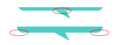
We are good but still have a tiny issue when the tail gets close to the extreme edges.

Showing two versions of the same tooltip where the tail overflows the container on the left and right edges, respectively, creating a jagged edge between the tail and tooltip.

(Large preview)

This visual glitch happens when the border-image overlaps with the rounded corners. To fix this, we need to adjust the border-radius value based on the tail’s position (--p).

We are not going to update all the radii, only the bottom ones and, more precisely, the horizontal values. I want to remind you that border-radius accepts up to eight values — each corner takes two values that set the horizontal and vertical directions — and in our case, we will update the horizontal value of the bottom-left and bottom-right corners:

border-radius:
  /* horizontal values */
  var(--r) 
  var(--r) 
  min(var(--r),100% - var(--p) - var(--b)/2) /* horizontal bottom-right */
  min(var(--r),var(--p) - var(--b)/2) /* horizontal bottom-left */
  /
  /* vertical values */
  var(--r)
  var(--r)
  var(--r)
  var(--r)

All the corner values are equal to --r, except for the bottom-left and bottom-right corners. Notice the forward slash (/), as it is part of the syntax that separates the horizontal and vertical radii values.

Now, let’s dig in and understand what is happening here. For the bottom-left corner, when the position of the tail is on the right, the position (--p) variable value will be big in order to keep the radius equal to the radius (--r), which serves as the minimum value. But when the position gets closer to the left, the value of --p decreases and, at some point, becomes smaller than the value of --r. The result is the value of the radius slowly decreasing until it reaches 0. It adjusts as the position updates!

I know that’s a lot to process, and a visual aid usually helps. Try slowly updating the tail’s position in the following demo to get a clearer picture of what’s happening.

See the Pen [Fixing the edge cases](https://codepen.io/smashingmag/pen/ZEPoJpG) by Temani Afif.

See the Pen Fixing the edge cases by Temani Afif.

What about instances when we want a custom shape for the tail? The technique we just used will only work when the tail has two equal sides — you know, an isosceles triangle. We need to adjust the border-image value and consider another trick to get things working correctly again.

Illustrating three steps for correcting the tooltip’s overflow when the tail is a custom shape.

(Large preview)

This time, the border image creates a horizontal bar along the bottom that is positioned directly under the element and extends outside of its boundary so that we have enough color for the tail when it’s closer to the edge.

.tooltip {
  /* tail dimension */
  --b: 2em; /* base */
  --h: 1.5em; /* height */

  --p: 50%; /* position */
  --x: 1.8em; /* tail position */
  --r: 1.2em; /* the radius */
  --c: #4ECDC4;

  border-radius: var(--r) var(--r) min(var(--r), 100% - var(--p) - var(--b) / 2) min(var(--r), var(--p) - var(--b) / 2) / var(--r);
  clip-path: polygon(0 100%, 0 0, 100% 0, 100% 100%,
    min(100%, var(--p) + var(--b) / 2) 100%,
    calc(var(--p) + var(--x)) calc(100% + var(--h)),
    max(0%, var(--p) - var(--b) / 2) 100%);
  background: var(--c);
  border-image: conic-gradient(var(--c) 0 0) 0 0 1 0 / 0 0 var(--h) 0 / 0 999px var(--h) 999px;
}

See the Pen [Custom tail with border radius](https://codepen.io/smashingmag/pen/MWxGEpv) by Temani Afif.

See the Pen Custom tail with border radius by Temani Afif.

Again, the border-image declaration looks strange and difficult because, well, it is! Please do yourself a favor and check my previous article if you want to dig deeper into this approach — you definitely won’t regret it.

“Why not use this approach for the first example we looked at?” you might ask. You are right that we can use this same approach for the first example, even if we don’t have the --x variable. That said, the reason we’re not going in that direction is that there is a tiny drawback to it in some particular cases, as you can see in the figure below.

Showing visual imperfections in the tooltip, including a gap between the tail and the tooltip, and a slight color bleed at the left and right edges of the container.

(Large preview)

That’s why I do not use this approach when working with a simple isosceles triangle. This said, the method is perfectly fine, and in most cases, you may not see any visual glitches.

Putting Everything Together

We’ve looked at tooltips with tails that have equal sides, ones with tails that change shape, ones where the tail changes position and direction, ones with rounded corners, and ones that are filled in with gradients. What would it look like if we combined all of these examples into one mega-demo?

We can do it, but not by combining the approaches we’ve covered. We need another method, this time using a pseudo-element. No border-image for this one, I promise!

.tooltip {
  /* triangle dimension */
  --b: 2em; /* base */
  --h: 1em; /* height */

  --p: 50%; /* position */
  --r: 1.2em; /* the radius */

  border-radius: var(--r) var(--r) min(var(--r), 100% - var(--p) - var(--b) / 2) min(var(--r), var(--p) - var(--b) / 2) / var(--r);
  background: 0 0 / 100% calc(100% + var(--h)) 
    linear-gradient(60deg, #CC333F, #4ECDC4); /* the gradient */
  position: relative;
  z-index: 0;
}
.tooltip:before {
  content: "";
  position: absolute;
  z-index: -1;
  inset: 0 0 calc(-1*var(--h));
  background-image: inherit;
  clip-path: 
    polygon(50% 50%,
      min(100%, var(--p) + var(--b) / 2) calc(100% - var(--h)),
      var(--p) 100%,
      max(0%, var(--p) - var(--b) / 2) calc(100% - var(--h)));
}

The pseudo-element is used to create the tail at the bottom and notice how it inherits the gradient from the main element to simulate a continuous gradient that covers the entire shape.

Showing the tail at bottom that inherits the gradient from the main element

(Large preview)

Another important thing to note is the background-size declared in the .tooltip. The pseudo-element is covering a bigger area due to the negative bottom value, so we have to increase the height of the gradient so it covers the same area.

See the Pen [Gradient and border radius](https://codepen.io/smashingmag/pen/ZEPoayw) by Temani Afif.

See the Pen Gradient and border radius by Temani Afif.

For the custom tail shape, we have to update the code slightly to consider the overflow on the left and right sides of the tooltip. The idea is to increase the gradient’s area when the tail is about to leave the container.

.tooltip {
  --p: 50%;  /* position  */
  --x: -2em; /* tail shape and direction */

  --_e: max(0%, -1 * var(--x) - var(--p), var(--x) + var(--p) - 100%);
  
  background:
    50% 0 / calc(100% + 2*var(--_e)) calc(100% + var(--h)) 
    linear-gradient(60deg, #CC333F, #4ECDC4); /* the gradient */
}
.tooltip:before {
  inset: 0 calc(-1 * var(--_e)) calc(-1 * var(--h));
  padding-inline: var(--_e);
}

Alongside the --x variable that controls the tail’s shape and direction, I have introduced a new variable, --_e, that defines the gradient’s width for covering the .tooltip as well as the pseudo-element’s inline padding and its left and right values. It may look like a complex configuration, but the idea is that --_e will, in most cases, be equal to 0, which gives us the same code as the last example we made. But when the tail overflows the .tooltip container, the --_e value increases, which increases the area of the gradient as well in order to cover the overflow.

Play with the position and shape of the tail in the following demo and notice how the gradient changes when the tail overflows the sides.

See the Pen [Custom tail with border radius and gradient](https://codepen.io/smashingmag/pen/RwdyExJ) by Temani Afif.

See the Pen Custom tail with border radius and gradient by Temani Afif.

I know this last code may look complex (same for some of the previous ones), and for this reason, I created an online collection of tooltips from where you can easily grab the code. I’ve tried to cover as many cases as possible, even the ones you will probably never need. That said, it’s good to have an idea of how to build various tooltip shapes.

One Last Thought

If we do the count, we have made 32 different tooltip shapes. That’s two types of color (solid or gradient), two types of corners (sharp or rounded) that produce four more variations, and two types of tail shapes (isosceles triangle and custom) for two additional variations, and four different tail positions (top, bottom, left, and right) which brings the final tally to 32 tooltip variations.

The last example we studied can be used to produce all the shapes simply by adjusting the different variables.

I know what you’re thinking: Why didn’t I simply share the last snippet and call it a day? Did this article really have to be so long when we could have jumped straight into the solution?

Sure, we could have done that, but If you compare the first example with only two CSS properties with the last example, the code for the last example is far too complex to create what can otherwise be accomplished in fewer lines. We started with a basic tooltip shape and embarked on a journey to make it account for more complex types of tooltips. Plus, we have learned a lot of tricks that can be useful in other situations and not necessarily for creating tooltips.

Conclusion

That’s all for Part 1 of this brief two-part series. We still have many more shapes to cover in Part 2, so take the time to digest what we covered in Part 1 before jumping ahead. In fact, here’s a little homework to help prepare you for Part 2: try creating the following tooltips using the CSS tricks you learned from this article.

Showing four different tooltip shapes

(Large preview)

Can you figure it out? The code for all of them is included in my tooltip collection if you need a reference, but do try to make them yourself — it’s good exercise! Maybe you will find a different (or perhaps better) approach than mine.

Smashing Editorial
(gg, yk)